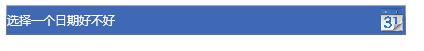
最近在开发中需要用到日历多选的功能,用户需要选择多个日期查询数据,Calender控件支持多选功能只需要设置SelectionMode="MultipleRange"就可以实现多选功能。我们的要求是点击日历图标的时候把日期控件显示出来,然后选择多个日期后把选择的日期放入文本框显示出来。
下面就开始把Calender重写下实现一套样式走天下
public class SunCalender : Calendar
    {
        /// <summary>
        /// 文本显示内容
        /// </summary>
        TextBlock textBlock;
        public override void OnApplyTemplate()
        {
            base.OnApplyTemplate();

            //选择按钮
            Button selectButton = this.Template.FindName("PART_SelectButton", this) as Button;
            selectButton.Click += SelectButton_Click;

            //清除按钮
            Button clearButton = this.Template.FindName("PART_ClearButton" , this) as Button;
            clearButton.Click += ClearButton_Click;


            textBlock = this.Template.FindName("PART_TextBlock", this) as TextBlock;
            textBlock.FocusableChanged += ContentPresenter_FocusableChanged;
        }

        private void ContentPresenter_FocusableChanged(object sender, DependencyPropertyChangedEventArgs e)
        {
            IsDropDwonOpen = true;
        }

        /// <summary>
        /// 清除选择的日期
        /// </summary>
        /// <param name="sender"></param>
        /// <param name="e"></param>
        private void ClearButton_Click(object sender, RoutedEventArgs e)
        {
            if(textBlock != null)
            {
                this.SelectedDates.Clear();
                IsDropDwonOpen = false;
                textBlock.Text = string.Empty;
            }
        }

        /// <summary>
        /// 确定选择的日期
        /// </summary>
        /// <param name="sender"></param>
        /// <param name="e"></param>
        private void SelectButton_Click(object sender, RoutedEventArgs e)
        {
            if(textBlock != null)
            {
                IsDropDwonOpen = false;

                string text = string.Join(DateTimeSeparator, this.SelectedDates.Select(w => w.ToString(DateTimeFormat)));

                textBlock.ToolTip = text.Replace(DateTimeSeparator, Environment.NewLine);
                textBlock.Text = text;

                if(Command != null)
                {
                    Command.Execute(null);
                }
            }
        }

        /// <summary>
        /// 显示隐藏控制
        /// </summary>
        public bool IsDropDwonOpen
        {
            get { return (bool)GetValue(IsDropDwonOpenProperty); }
            set { SetValue(IsDropDwonOpenProperty, value); }

        }

        public static readonly DependencyProperty IsDropDwonOpenProperty = DependencyProperty.Register("IsDropDwonOpen",
            typeof(bool), typeof(SunCalender), new FrameworkPropertyMetadata());

        /// <summary>
        /// 显示格式
        /// </summary>
        public string DateTimeFormat
        {
            get { return (string)GetValue(DateTimeFormatProperty); }
            set { SetValue(DateTimeFormatProperty, value); }

        }

        public static readonly DependencyProperty DateTimeFormatProperty = DependencyProperty.Register("DateTimeFormat",
            typeof(string), typeof(SunCalender), new FrameworkPropertyMetadata());

        /// <summary>
        /// 分隔符
        /// </summary>
        public string DateTimeSeparator
        {
            get { return (string)GetValue(DateTimeSeparatorProperty); }
            set { SetValue(DateTimeSeparatorProperty, value); }

        }

        public static readonly DependencyProperty DateTimeSeparatorProperty = DependencyProperty.Register("DateTimeSeparator",
            typeof(string), typeof(SunCalender), new FrameworkPropertyMetadata());

        /// <summary>
        /// 下拉按钮图标
        /// </summary>
        public string DropDwonButtonIcon
        {
            get { return (string)GetValue(DropDwonButtonIconProperty); }
            set { SetValue(DropDwonButtonIconProperty, value); }

        }

        public static readonly DependencyProperty DropDwonButtonIconProperty = DependencyProperty.Register("DropDwonButtonIcon",
            typeof(string), typeof(SunCalender), new FrameworkPropertyMetadata());

        /// <summary>
        /// 选择命令
        /// </summary>
        public ICommand Command
        {
            get
            {
                return (ICommand)GetValue(CommandProperty);
            }
            set
            {
                SetValue(CommandProperty, value);
            }
        }

        public static readonly DependencyProperty CommandProperty =
                DependencyProperty.Register("Command", typeof(ICommand), typeof(SunCalender));
    }
首先写一个类继承Calender 重写下它的OnApplyTemplate方法,下面再将里面都做了 写什么事情
这个类里还定义了一些依赖属性,控制显示隐藏的,显示日期格式,还有多日期分隔符,日历图标属性。
下面开始写样式,样式有写多
<Style x:Key="CalendarStyle1" TargetType="{x:Type local:SunCalender}">
        <Setter Property="Template">
            <Setter.Value>
                <ControlTemplate TargetType="{x:Type Calendar}">
                    <StackPanel x:Name="PART_Root" HorizontalAlignment="Center">
                        <Grid Background="{TemplateBinding Background}">
                            <Border x:Name="ContentPresenterBorder" BorderBrush="{TemplateBinding BorderBrush}" BorderThickness="{TemplateBinding BorderThickness}" Width="{TemplateBinding Width}" Height="{TemplateBinding Height}">
                                <Grid>
                                    <Grid.ColumnDefinitions>
                                        <ColumnDefinition Width="*" />
                                        <ColumnDefinition Width="25" />
                                    </Grid.ColumnDefinitions>
                                    <ToggleButton x:Name="DropDownToggle" Grid.Column="1" Cursor="Hand"
                                                          IsChecked="{Binding Path=IsDropDwonOpen,RelativeSource={RelativeSource TemplatedParent},Mode=TwoWay}"
                                                          HorizontalAlignment="Stretch" VerticalAlignment="Stretch"
                                                          HorizontalContentAlignment="Right" Background="Transparent" Style="{DynamicResource ToggleButtonStyle1}">
                                        <Image Source="{Binding Path=DropDwonButtonIcon,RelativeSource={RelativeSource TemplatedParent},Converter={StaticResource ImageConvert}}" Stretch="Uniform"/>
                                    </ToggleButton>
                                    <ContentPresenter x:Name="ContentPresenter" Margin="6,2,25,2" Visibility="Hidden" />
                                    <TextBlock x:Name="PART_TextBlock" Foreground="{TemplateBinding Foreground}" Grid.Column="0" VerticalAlignment="Center" />
                                </Grid>
                            </Border>
                            <Popup x:Name="Popup" IsOpen="{Binding Path=IsDropDwonOpen,RelativeSource={RelativeSource TemplatedParent}}">
                                <Grid Background="{TemplateBinding Background}">
                                    <Grid.RowDefinitions>
                                        <RowDefinition/>
                                        <RowDefinition/>
                                    </Grid.RowDefinitions>
                                    <CalendarItem Grid.Row="0" x:Name="PART_CalendarItem" Width="{TemplateBinding Width}" BorderBrush="{x:Null}"
                                                      BorderThickness="0" Background="{TemplateBinding Background}"
                                                      Style="{DynamicResource CalendarItemStyle1}"/>
                                    <StackPanel Grid.Row="1" HorizontalAlignment="Right" Orientation="Horizontal">
                                        <Button x:Name="PART_ClearButton" Content="清除" Margin="2" Cursor="Hand"/>
                                        <Button x:Name="PART_SelectButton" Content="选择" Margin="2" Cursor="Hand"/>
                                    </StackPanel>
                                </Grid>
                            </Popup>
                        </Grid>

                    </StackPanel>
                </ControlTemplate>
            </Setter.Value>
        </Setter>
    </Style>
这里修改了下Calender的模板,这个模板里写了选择完日期显示的文本,还有日历图标按钮,还有就是日历。点击日历图标的时候显示,ToggleButton就是那个控制显示隐藏日历的按钮,通过它的IsChecked属性来更改IsDropDwonOpen属性值,IsDropDwonOpen的改变控制了Popup的IsOpen属性,Popup中包含了日历的控件等。
<Style x:Key="CalendarItemStyle1" TargetType="{x:Type CalendarItem}">
<Setter Property="Template">
<Setter.Value>
<ControlTemplate TargetType="{x:Type CalendarItem}">
<ControlTemplate.Resources>
<DataTemplate x:Key="{x:Static CalendarItem.DayTitleTemplateResourceKey}">
<TextBlock Foreground="White" FontWeight="Bold" FontSize="9.5" FontFamily="Verdana" HorizontalAlignment="Center" Margin="0,6,0,6" Text="{Binding}" VerticalAlignment="Center"/>
</DataTemplate>
</ControlTemplate.Resources>
<Grid x:Name="PART_Root">
<Grid.Resources>
<SolidColorBrush x:Key="DisabledColor" Color="#A5FFFFFF"/>
</Grid.Resources>
<VisualStateManager.VisualStateGroups>
<VisualStateGroup x:Name="CommonStates">
<VisualState x:Name="Normal"/>
<VisualState x:Name="Disabled">
<Storyboard>
<DoubleAnimation Duration="0" To="1" Storyboard.TargetProperty="Opacity" Storyboard.TargetName="PART_DisabledVisual"/>
</Storyboard>
</VisualState>
<VisualState x:Name="Unfocused">
<Storyboard>
<DoubleAnimation Duration="0" To="1" Storyboard.TargetProperty="Opacity" Storyboard.TargetName="PART_DisabledVisual"/>
</Storyboard>
</VisualState>
</VisualStateGroup>
</VisualStateManager.VisualStateGroups>
<Border Background="{TemplateBinding Background}" BorderBrush="{x:Null}">
<Grid>
<Grid.Resources>
<ControlTemplate x:Key="PreviousButtonTemplate" TargetType="{x:Type Button}">
<Grid Cursor="Hand">
<VisualStateManager.VisualStateGroups>
<VisualStateGroup x:Name="CommonStates">
<VisualState x:Name="Normal"/>
<VisualState x:Name="MouseOver">
<Storyboard>
<ColorAnimation Duration="0" To="#FF73A9D8" Storyboard.TargetProperty="(Shape.Fill).(SolidColorBrush.Color)" Storyboard.TargetName="path"/>
</Storyboard>
</VisualState>
<VisualState x:Name="Disabled">
<Storyboard>
<DoubleAnimation Duration="0" To=".5" Storyboard.TargetProperty="(Shape.Fill).(Brush.Opacity)" Storyboard.TargetName="path"/>
</Storyboard>
</VisualState>
</VisualStateGroup>
</VisualStateManager.VisualStateGroups>
<Rectangle Fill="#11E5EBF1" Opacity="1" Stretch="Fill"/>
<Grid>
<Path x:Name="path" Data="M288.75,232.25 L288.75,240.625 L283,236.625 z" Fill="#ffffff" HorizontalAlignment="Left" Height="10" Margin="14,0,0,0" Stretch="Fill" VerticalAlignment="Center" Width="6"/>
</Grid>
</Grid>
</ControlTemplate>
<ControlTemplate x:Key="NextButtonTemplate" TargetType="{x:Type Button}">
<Grid Cursor="Hand">
<VisualStateManager.VisualStateGroups>
<VisualStateGroup x:Name="CommonStates">
<VisualState x:Name="Normal"/>
<VisualState x:Name="MouseOver">
<Storyboard>
<ColorAnimation Duration="0" To="#FF73A9D8" Storyboard.TargetProperty="(Shape.Fill).(SolidColorBrush.Color)" Storyboard.TargetName="path"/>
</Storyboard>
</VisualState>
<VisualState x:Name="Disabled">
<Storyboard>
<DoubleAnimation Duration="0" To=".5" Storyboard.TargetProperty="(Shape.Fill).(Brush.Opacity)" Storyboard.TargetName="path"/>
</Storyboard>
</VisualState>
</VisualStateGroup>
</VisualStateManager.VisualStateGroups>
<Rectangle Fill="#11E5EBF1" Opacity="1" Stretch="Fill"/>
<Grid>
<Path x:Name="path" Data="M282.875,231.875 L282.875,240.375 L288.625,236 z" Fill="#ffffff" HorizontalAlignment="Right" Height="10" Margin="0,-6,14,0" Stretch="Fill" VerticalAlignment="Center" Width="6"/>
</Grid>
</Grid>
</ControlTemplate>
<ControlTemplate x:Key="HeaderButtonTemplate" TargetType="{x:Type Button}">
<Grid Cursor="Hand">
<VisualStateManager.VisualStateGroups>
<VisualStateGroup x:Name="CommonStates">
<VisualState x:Name="Normal"/>
<VisualState x:Name="MouseOver">
<Storyboard>
<ColorAnimation Duration="0" To="#FF73A9D8" Storyboard.TargetProperty="(TextElement.Foreground).(SolidColorBrush.Color)" Storyboard.TargetName="buttonContent"/>
</Storyboard>
</VisualState>
<VisualState x:Name="Disabled">
<Storyboard>
<DoubleAnimation Duration="0" To=".5" Storyboard.TargetProperty="Opacity" Storyboard.TargetName="buttonContent"/>
</Storyboard>
</VisualState>
</VisualStateGroup>
</VisualStateManager.VisualStateGroups>
<ContentPresenter x:Name="buttonContent" ContentTemplate="{TemplateBinding ContentTemplate}" Content="{TemplateBinding Content}" TextElement.Foreground="White" HorizontalAlignment="{TemplateBinding HorizontalContentAlignment}" Margin="1,4,1,9" VerticalAlignment="{TemplateBinding VerticalContentAlignment}"/>
</Grid>
</ControlTemplate>
</Grid.Resources>
<Grid.ColumnDefinitions>
<ColumnDefinition Width="*"/>
<ColumnDefinition Width="*"/>
<ColumnDefinition Width="*"/>
</Grid.ColumnDefinitions>
<Grid.RowDefinitions>
<RowDefinition Height="Auto"/>
<RowDefinition Height="*"/>
</Grid.RowDefinitions>
<Button x:Name="PART_PreviousButton" Grid.Column="0" Focusable="False" HorizontalAlignment="Left" Height="20" Grid.Row="0" Template="{StaticResource PreviousButtonTemplate}" Width="28"/>
<Button x:Name="PART_HeaderButton" Grid.Column="1" FontWeight="Bold" Focusable="False" FontSize="10.5" HorizontalAlignment="Center" Grid.Row="0" Template="{StaticResource HeaderButtonTemplate}" VerticalAlignment="Center"/>
<Button x:Name="PART_NextButton" Grid.Column="2" Focusable="False" HorizontalAlignment="Right" Height="20" Grid.Row="0" Template="{StaticResource NextButtonTemplate}" Width="28"/>
<Grid x:Name="PART_MonthView" Grid.ColumnSpan="3" HorizontalAlignment="Center" Margin="6,-1,6,6" Grid.Row="1" Visibility="Visible">
<Grid.ColumnDefinitions>
<ColumnDefinition Width="*"/>
<ColumnDefinition Width="*"/>
<ColumnDefinition Width="*"/>
<ColumnDefinition Width="*"/>
<ColumnDefinition Width="*"/>
<ColumnDefinition Width="*"/>
<ColumnDefinition Width="*"/>
</Grid.ColumnDefinitions>
<Grid.RowDefinitions>
<RowDefinition Height="*"/>
<RowDefinition Height="*"/>
<RowDefinition Height="*"/>
<RowDefinition Height="*"/>
<RowDefinition Height="*"/>
<RowDefinition Height="*"/>
<RowDefinition Height="*"/>
</Grid.RowDefinitions>
</Grid>
<Grid x:Name="PART_YearView" Grid.ColumnSpan="3" HorizontalAlignment="Center" Margin="6,-3,7,6" Grid.Row="1" Visibility="Hidden">
<Grid.ColumnDefinitions>
<ColumnDefinition Width="*"/>
<ColumnDefinition Width="*"/>
<ColumnDefinition Width="*"/>
<ColumnDefinition Width="*"/>
</Grid.ColumnDefinitions>
<Grid.RowDefinitions>
<RowDefinition Height="*"/>
<RowDefinition Height="*"/>
<RowDefinition Height="*"/>
</Grid.RowDefinitions>
</Grid>
</Grid>
</Border>
<Rectangle x:Name="PART_DisabledVisual" Fill="{StaticResource DisabledColor}" Opacity="0" RadiusY="2" RadiusX="2" Stretch="Fill" Stroke="{StaticResource DisabledColor}" StrokeThickness="1" Visibility="Collapsed"/>
</Grid>
<ControlTemplate.Triggers>
<Trigger Property="IsEnabled" Value="False">
<Setter Property="Visibility" TargetName="PART_DisabledVisual" Value="Visible"/>
</Trigger>
<DataTrigger Binding="{Binding DisplayMode, RelativeSource={RelativeSource FindAncestor, AncestorType={x:Type Calendar}}}" Value="Year">
<Setter Property="Visibility" TargetName="PART_MonthView" Value="Hidden"/>
<Setter Property="Visibility" TargetName="PART_YearView" Value="Visible"/>
</DataTrigger>
<DataTrigger Binding="{Binding DisplayMode, RelativeSource={RelativeSource FindAncestor, AncestorType={x:Type Calendar}}}" Value="Decade">
<Setter Property="Visibility" TargetName="PART_MonthView" Value="Hidden"/>
<Setter Property="Visibility" TargetName="PART_YearView" Value="Visible"/>
</DataTrigger>
</ControlTemplate.Triggers>
</ControlTemplate>
</Setter.Value>
</Setter>
</Style>这部分样式控制了日历显示的项,比如显示出来的日历背景更换,宽高等。
<Style x:Key="CalendarDayButtonStyle1" TargetType="{x:Type CalendarDayButton}">
        <Setter Property="MinWidth" Value="5"/>
        <Setter Property="MinHeight" Value="5"/>
        <Setter Property="FontSize" Value="10"/>
        <Setter Property="HorizontalContentAlignment" Value="Center"/>
        <Setter Property="VerticalContentAlignment" Value="Center"/>
        <Setter Property="Template">
            <Setter.Value>
                <ControlTemplate TargetType="{x:Type CalendarDayButton}">
                    <Grid>
                        <VisualStateManager.VisualStateGroups>
                            <VisualStateGroup x:Name="CommonStates">
                                <VisualStateGroup.Transitions>
                                    <VisualTransition From="{x:Null}" GeneratedDuration="0:0:0.1" GeneratedEasingFunction="{x:Null}" Storyboard="{x:Null}" To="{x:Null}"/>
                                </VisualStateGroup.Transitions>
                                <VisualState x:Name="Normal"/>
                                <VisualState x:Name="MouseOver">
                                    <Storyboard>
                                        <DoubleAnimation Duration="0" To="0.5" Storyboard.TargetProperty="Opacity" Storyboard.TargetName="HighlightBackground"/>
                                    </Storyboard>
                                </VisualState>
                                <VisualState x:Name="Pressed">
                                    <Storyboard>
                                        <DoubleAnimation Duration="0" To="0.5" Storyboard.TargetProperty="Opacity" Storyboard.TargetName="HighlightBackground"/>
                                    </Storyboard>
                                </VisualState>
                                <VisualState x:Name="Disabled">
                                    <Storyboard>
                                        <DoubleAnimation Duration="0" To="0" Storyboard.TargetProperty="Opacity" Storyboard.TargetName="HighlightBackground"/>
                                        <DoubleAnimation Duration="0" To="0.35" Storyboard.TargetProperty="Opacity" Storyboard.TargetName="NormalText"/>
                                    </Storyboard>
                                </VisualState>
                            </VisualStateGroup>
                            <VisualStateGroup x:Name="SelectionStates">
                                <VisualStateGroup.Transitions>
                                    <VisualTransition From="{x:Null}" GeneratedDuration="0" GeneratedEasingFunction="{x:Null}" Storyboard="{x:Null}" To="{x:Null}"/>
                                </VisualStateGroup.Transitions>
                                <VisualState x:Name="Unselected"/>
                                <VisualState x:Name="Selected">
                                    <Storyboard>
                                        <DoubleAnimation Duration="0" To="0.75" Storyboard.TargetProperty="Opacity" Storyboard.TargetName="SelectedBackground"/>
                                    </Storyboard>
                                </VisualState>
                            </VisualStateGroup>
                            <VisualStateGroup x:Name="CalendarButtonFocusStates">
                                <VisualStateGroup.Transitions>
                                    <VisualTransition From="{x:Null}" GeneratedDuration="0" GeneratedEasingFunction="{x:Null}" Storyboard="{x:Null}" To="{x:Null}"/>
                                </VisualStateGroup.Transitions>
                                <VisualState x:Name="CalendarButtonFocused">
                                    <Storyboard>
                                        <ObjectAnimationUsingKeyFrames Duration="0" Storyboard.TargetProperty="Visibility" Storyboard.TargetName="DayButtonFocusVisual">
                                            <DiscreteObjectKeyFrame KeyTime="0">
                                                <DiscreteObjectKeyFrame.Value>
                                                    <Visibility>Visible</Visibility>
                                                </DiscreteObjectKeyFrame.Value>
                                            </DiscreteObjectKeyFrame>
                                        </ObjectAnimationUsingKeyFrames>
                                    </Storyboard>
                                </VisualState>
                                <VisualState x:Name="CalendarButtonUnfocused">
                                    <Storyboard>
                                        <ObjectAnimationUsingKeyFrames Duration="0" Storyboard.TargetProperty="Visibility" Storyboard.TargetName="DayButtonFocusVisual">
                                            <DiscreteObjectKeyFrame KeyTime="0">
                                                <DiscreteObjectKeyFrame.Value>
                                                    <Visibility>Collapsed</Visibility>
                                                </DiscreteObjectKeyFrame.Value>
                                            </DiscreteObjectKeyFrame>
                                        </ObjectAnimationUsingKeyFrames>
                                    </Storyboard>
                                </VisualState>
                            </VisualStateGroup>
                            <VisualStateGroup x:Name="ActiveStates">
                                <VisualStateGroup.Transitions>
                                    <VisualTransition From="{x:Null}" GeneratedDuration="0" GeneratedEasingFunction="{x:Null}" Storyboard="{x:Null}" To="{x:Null}"/>
                                </VisualStateGroup.Transitions>
                                <VisualState x:Name="Active"/>
                                <VisualState x:Name="Inactive">
                                    <Storyboard>
                                        <ColorAnimation Duration="0" To="#b2b2b2" Storyboard.TargetProperty="(TextElement.Foreground).(SolidColorBrush.Color)" Storyboard.TargetName="NormalText"/>
                                    </Storyboard>
                                </VisualState>
                            </VisualStateGroup>
                            <VisualStateGroup x:Name="DayStates">
                                <VisualStateGroup.Transitions>
                                    <VisualTransition From="{x:Null}" GeneratedDuration="0" GeneratedEasingFunction="{x:Null}" Storyboard="{x:Null}" To="{x:Null}"/>
                                </VisualStateGroup.Transitions>
                                <VisualState x:Name="RegularDay"/>
                                <VisualState x:Name="Today">
                                    <Storyboard>
                                        <DoubleAnimation Duration="0" To="1" Storyboard.TargetProperty="Opacity" Storyboard.TargetName="TodayBackground"/>
                                        <ColorAnimation Duration="0" To="White" Storyboard.TargetProperty="(TextElement.Foreground).(SolidColorBrush.Color)" Storyboard.TargetName="NormalText"/>
                                    </Storyboard>
                                </VisualState>
                            </VisualStateGroup>
                            <VisualStateGroup x:Name="BlackoutDayStates">
                                <VisualStateGroup.Transitions>
                                    <VisualTransition From="{x:Null}" GeneratedDuration="0" GeneratedEasingFunction="{x:Null}" Storyboard="{x:Null}" To="{x:Null}"/>
                                </VisualStateGroup.Transitions>
                                <VisualState x:Name="NormalDay"/>
                                <VisualState x:Name="BlackoutDay">
                                    <Storyboard>
                                        <DoubleAnimation Duration="0" To="0.2" Storyboard.TargetProperty="Opacity" Storyboard.TargetName="Blackout"/>
                                    </Storyboard>
                                </VisualState>
                            </VisualStateGroup>
                        </VisualStateManager.VisualStateGroups>
                        <Rectangle x:Name="TodayBackground" Fill="#FFAAAAAA" Opacity="0" RadiusY="1" RadiusX="1"/>
                        <Rectangle x:Name="SelectedBackground" Fill="#FFBADDE9" Opacity="0" RadiusY="1" RadiusX="1"/>
                        <Border BorderBrush="{TemplateBinding BorderBrush}" BorderThickness="{TemplateBinding BorderThickness}" Background="{TemplateBinding Background}"/>
                        <Rectangle x:Name="HighlightBackground" Fill="#FFBADDE9" Opacity="0" RadiusY="1" RadiusX="1"/>
                        <ContentPresenter x:Name="NormalText" ContentTemplate="{TemplateBinding ContentTemplate}" Content="{TemplateBinding Content}" ContentStringFormat="{TemplateBinding ContentStringFormat}" TextElement.Foreground="#ffffff" HorizontalAlignment="{TemplateBinding HorizontalContentAlignment}" Margin="5,1" VerticalAlignment="{TemplateBinding VerticalContentAlignment}"/>
                        <Path x:Name="Blackout" Data="M8.1772461,11.029181L10.433105,11.029181 11.700684,12.801641 12.973633,11.029181 15.191895,11.029181 12.844727,13.999395 15.21875,17.060919 12.962891,17.060919 11.673828,15.256231 10.352539,17.060919 8.1396484,17.060919 10.519043,14.042364z" Fill="Black" HorizontalAlignment="Stretch" Margin="3" Opacity="0" RenderTransformOrigin="0.5,0.5" Stretch="Fill" VerticalAlignment="Stretch"/>
                        <Rectangle x:Name="DayButtonFocusVisual" IsHitTestVisible="False" RadiusY="1" RadiusX="1" Stroke="#FF45D6FA" Visibility="Collapsed"/>
                    </Grid>
                </ControlTemplate>
            </Setter.Value>
        </Setter>
    </Style>
这是日历的每一天的显示控制。
<Style x:Key="CalendarButtonStyle" TargetType="{x:Type CalendarButton}">
        <Setter Property="Background" Value="Transparent" />
        <Setter Property="MinWidth" Value="40" />
        <Setter Property="MinHeight" Value="42" />
        <Setter Property="FontSize" Value="{StaticResource FontSize}" />
        <Setter Property="FontFamily" Value="{StaticResource FontFamily}" />
        <Setter Property="HorizontalContentAlignment" Value="Center" />
        <Setter Property="VerticalContentAlignment" Value="Center" />
        <Setter Property="Template">
            <Setter.Value>
                <ControlTemplate TargetType="{x:Type CalendarButton}">
                    <Grid x:Name="Grid" Margin="{TemplateBinding Margin}">
                        <ContentPresenter x:Name="NormalText" HorizontalAlignment="{TemplateBinding HorizontalContentAlignment}"
                                          Margin="5,2,5,2" VerticalAlignment="{TemplateBinding VerticalContentAlignment}"
                                          TextElement.Foreground="{TemplateBinding Foreground}" />
                    </Grid>
                    <ControlTemplate.Triggers>
                        <Trigger Property="IsFocused" Value="True">
                            <Setter Property="Background" Value="#FFBADDE9"></Setter>
                            <Setter Property="Foreground" Value="#ffffff"></Setter>
                        </Trigger>
                        <Trigger Property="IsMouseOver" Value="True">
                            <Setter Property="Background" Value="#FFBADDE9"></Setter>
                            <Setter Property="Foreground" Value="#ffffff"></Setter>
                        </Trigger>
                        <!--不在当月的日期-->
                        <Trigger Property="IsInactive" Value="True">
                            <Setter Property="Opacity" Value="0.8" TargetName="Grid"></Setter>
                        </Trigger>
                        <Trigger Property="IsEnabled" Value="False">
                            <Setter Property="Opacity" Value="{StaticResource DisableOpacity}" TargetName="Grid"></Setter>
                        </Trigger>
                    </ControlTemplate.Triggers>
                </ControlTemplate>
            </Setter.Value>
        </Setter>
    </Style>
年和月的控制,下面是样式展现出来的效果图:
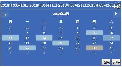
样式基本这些,下面说下OnApplyTemplate里做了下什么事。上图中选择完日期后需要点击选择按钮才会把选择的日期填入文本框中,我们需要把选择按钮点击的事件提前绑定起来,和点击清楚的时候把文本框内容清除掉的按钮事件提前绑定起来。
还有一个自定义的命令没有介绍,由于我们需要在点击选择后去根据日期查询数据,所以这个命令就是在点击选择的时候执行的。下面介绍下如何使用这个控件
<local:SunCalender HorizontalAlignment="Left" SelectionMode="MultipleRange" Width="400" Height="30" VerticalAlignment="Top"
                           Foreground="White" Background="#3f69b5" CalendarDayButtonStyle="{DynamicResource CalendarDayButtonStyle1}"
                           CalendarButtonStyle="{StaticResource CalendarButtonStyle}"
                           DropDwonButtonIcon="/Resources/Images/calender/google_calendar.png"
                           Command="{Binding SelectedDataCmd}"
                           Style="{DynamicResource CalendarStyle1}" DateTimeFormat="yyyy年MM月dd日" DateTimeSeparator="," Margin="50,18,0,0"/>
这样封装起来使用比较方便了
DateTimeFormat 来设置选择日期后文本框显示日期的格式
DateTimeSeparator 设置文本框中多个日期怎么分隔显示的
DropDwonButtonIcon 就是那个日历小图标
Command 在你点击选择按的时候会执行SelectedDataCmd方法