直接上代码
let option = {
tooltip: {
trigger: 'item'
},
legend: {
x: "center",
y: "bottom",
bottom: '50%',
padding: [0, 0, 0, 0],
orient: "horizontal", // 竖直
data: ["正常设备", "故障设备", "未知设备"],
textStyle: {
//图例文字的样式
color: "#333", //文字颜色
fontSize: 12 //文字大小
}
},
color:['#5470c6', '#91cc75', '#fac858', '#ee6666', '#73c0de', '#3ba272', '#fc8452', '#9a60b4', '#ea7ccc'],
series: [
{
type: 'pie',
radius: ['40%', '70%'],
avoidLabelOverlap: false,
emphasis: {
label: {
show: true,
fontSize: '10',
fontWeight: 'bold'
}
},
label:{
show: false,
position: 'center',
formatter: '{c} ({d}%) \n {b} '
},
labelLine: {
show: false
},
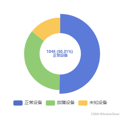
data: [
{ value: 1048, name: '正常设备' },
{ value: 735, name: '故障设备' },
{ value: 300, name: '未知设备' }
],
tooltip: {
formatter: (params) => {
// 表示不显示tooltip
return '';
}
}
}
]
}
let chart = echarts.init(document.getElementById("chart"));
chart.setOption(option); 效果
知识点
1. 代码第 44 - 49 行,不显示 tooltip;
2. 代码第 31 - 35 行,label 改造,显示个数、百分比和名称。注意 label中转行用 \n,而 tooltip使用 <br>;
3. 代码第 18 行,自定义调色板列表,可参考官网;
版权声明:本文为sinat_31213021原创文章,遵循CC 4.0 BY-SA版权协议,转载请附上原文出处链接和本声明。