[3, 4],
],
type: “line”,
},
],
};
[](()折线图样式设置
[](()折线图样式
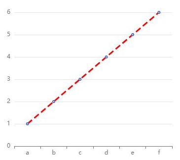
折线图中折线的样式可以通过 lineStyle 设置。可以为其指定颜色、线宽、折线类型、阴影、不透明度等等,具体的可以参考配置项手册 [series.lineStyle](() 了解。
这里,我们以设置颜色(color)、线宽(width)和折线类型(type)为例说明。
option = {
xAxis: {
data: [“a”, “b”, “c”, “d”, “e”, “f”],
},
yAxis: {},
series: {
data: [1, 2, 3, 4, 5, 6],
type: “line”,
lineStyle: {
normal: {
color: “red”,
width: 3,
type: “dashed”,
},
},
},
};
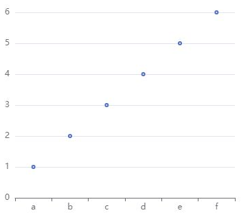
[](()数据点样式
数据点的样式可以通过 [series.itemStyle](() 指定填充颜色(color)、描边颜色(borderColor)、描边宽度(borderWidth)、描边类型(borderType)、阴影(shadowColor)、不透明度(opacity)等。
案例:
option = {
xAxis: {
data: [“a”, “b”, “c”, “d”, “e”, “f”],
},
yAxis: {},
series: {
data: [1, 2, 3, 4, 5, 6],
type: “line”,
lineStyle: {
normal: {
opacity: 0,
},
},
},
};
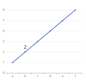
[](()在数据点处显示数值
在系列中,这数据点的标签通过 [series.label](() 属性指定。
如果将 label 下的 show 指定为true,则表示该数值默认时就显示;
如果为 false,而 [series.emphasis.label.show](() 为 true,则表示只有在鼠标移动到该数据时,才显示数值。
option = {
xAxis: {
data: [“a”, “b”, “c”, “d”, “e”, “f”],
},
yAxis: {},
series: {
data: [1, 2, 3, 4, 5, 6],
type: “line”,
label: {
show: false,
position: “top”,
textStyle: {
fontSize: 20,
},
},
emphasis: {
label: {
show: true,
},
},
},
};
[](()空数据
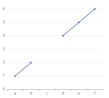
在一个系列中,可能一个横坐标对应的取值是“空”的,将其设为 0 有时并不能满足我们的期望–空数据不应被其左右的数据连接。
在 ECharts 中,我们使用字符串 '-' 表示空数据,这对其他系列的数据也是适用的。
option = {
xAxis: {
data: [“a”, “b”, “c”, “d”, “e”, “f”],
},
yAxis: {},
series: {
data: [1, 2, ‘-’, 4, 5, 6],
type: “line”,
},
};
[](()堆叠折线图
====================================================================
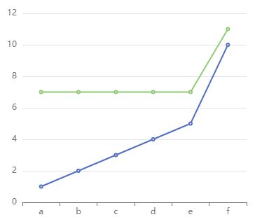
与堆叠柱状图类似,堆叠折线图也是用系列的 stack 设置哪些系列堆叠在一起。
opt 《大厂前端面试题解析+Web核心总结学习笔记+企业项目实战源码+最新高清讲解视频》无偿开源 徽信搜索公众号【编程进阶路】 ion = {
xAxis: {
data: [“a”, “b”, “c”, “d”, “e”, “f”],
},
yAxis: {},
series: [
{
data: [1, 2, 3, 4, 5, 10],
type: “line”,
stack: “x”,
},
{
data: [6, 5, 4, 3, 2, 1],
type: “line”,
stack: “x”,
},
],
};
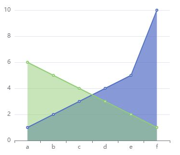
但是不同的是,如果不加说明的话,我们很难判断出这是一个堆叠折线图,还是一个普通的折线图。
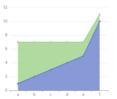
所以,对于堆叠折线图而言,一般建议使用区域填充色以表明堆叠的情况。
option = {
xAxis: {
data: [“a”, “b”, “c”, “d”, “e”, “f”],
},
yAxis: {},
series: [
{
data: [1, 2, 3, 4, 5, 10],
type: “line”,
stack: “x”,
areaStyle: {},
},
{
data: [6, 5, 4, 3, 2, 1],
type: “line”,
stack: “x”,
areaStyle: {},
},
],
};
[](()区域面积图
====================================================================
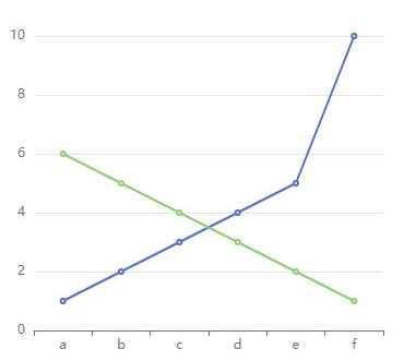
当然你也可以不堆叠,这样更适合对比
option = {
xAxis: {
data: [“a”, “b”, “c”, “d”, “e”, “f”],
},
yAxis: {},
series: [
{
data: [1, 2, 3, 4, 5, 10],
type: “line”,
stack: “x”,
},
{
data: [6, 5, 4, 3, 2, 1],
type: “line”,
stack: “y”,
},
],
};
区域面积图将折线到坐标轴的空间设置背景色,用区域面积表达数据。
相比普通的折线图,区域面积图的视觉效果更加饱满丰富,在系列不多的场景下尤其适用。