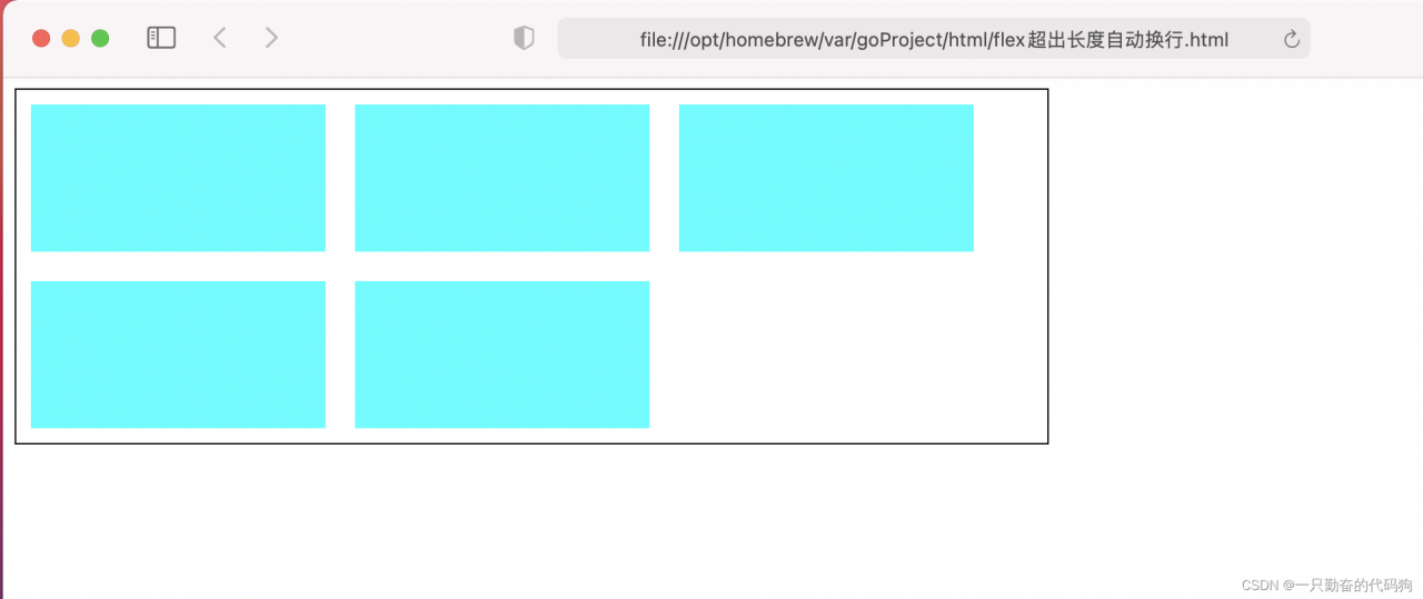
效果图
<!DOCTYPE html>
<html lang="en">
<head>
    <meta charset="UTF-8">
    <meta http-equiv="X-UA-Compatible" content="IE=edge">
    <meta name="viewport" content="width=device-width, initial-scale=1.0">
    <title>flex超出长度自动换行</title>

    <style >

        .container{

            width: 700px;
            border: solid 1px black;
            display: flex;
            flex-wrap: wrap;
        }
        .container div{

            width: 200px;
            margin: 10px;
            height: 100px;
            background-color: aqua;
            flex-shrink: 0;/*去除flex子元素宽度均分问题*/
        }

    </style>

</head>
<body>

    <div class="container">
        <div class="div1"></div>
        <div class="div2"></div>
        <div class="div3"></div>
        <div class="div4"></div>
        <div class="div5"></div>
    </div>

</body>
</html>
版权声明:本文为gaoxuaiguoyi原创文章,遵循CC 4.0 BY-SA版权协议,转载请附上原文出处链接和本声明。