上次我们使用HTML对新浪页面的导航栏进行了模仿,这一次我们打算更进一步,模仿整个页面。
由于新浪的页面创建的比较早,所以仅仅用静态的CSS样式和HTML就可以全部实现;
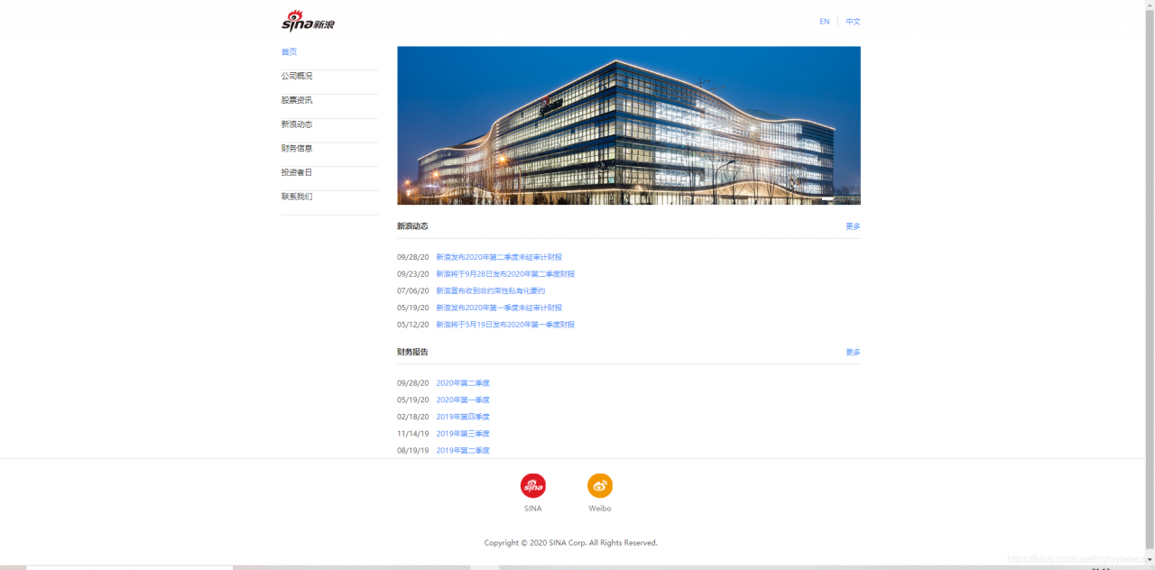
我们要模仿的界面如图:
此网页我们可以分为三部分:
1.头部
2.内容
3.尾页
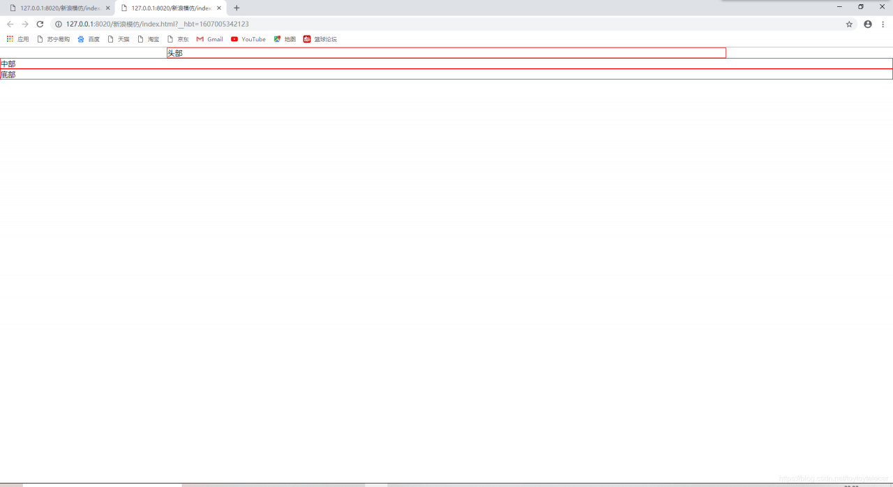
所以为了系统的把控全局页面,我们先写出大致的轮廓,并且在每一个部分加上边框方便观看:
<!DOCTYPE html>
<html>
	<head>
		<meta charset="utf-8" />
		<title></title>
	</head>
	<!--先勾勒出整个网页的结构-->
	<style>
		*{										/*通配符选择器清除默认值*/
			margin: 0px;
			padding: 0px;
		}
		#header,#container,#footer{				/*加上边框方便观看大致网页框架*/
			border: 1px solid red;
		}
	</style>
	<body>

		<div id="header">头部</div>
		<div id="container">中部</div>
		<div id="footer">底部</div>
	</body>
</html>
执行出来的效果是这样的:
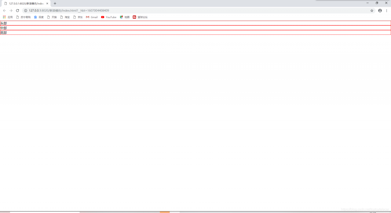
这就类似于一个草图,下面我们在这个草图上添加内容即可。
1.head头部部分
我们可以分析一下头部部分的组成:
1.可以看出头部部分宽度并非填满整个浏览器界面,所以我们首先要设置宽度;
2.整个head部分由左边的logo和右边的超链接组成
分析完头部部分的组成后,我们就可以逐步开始写了。
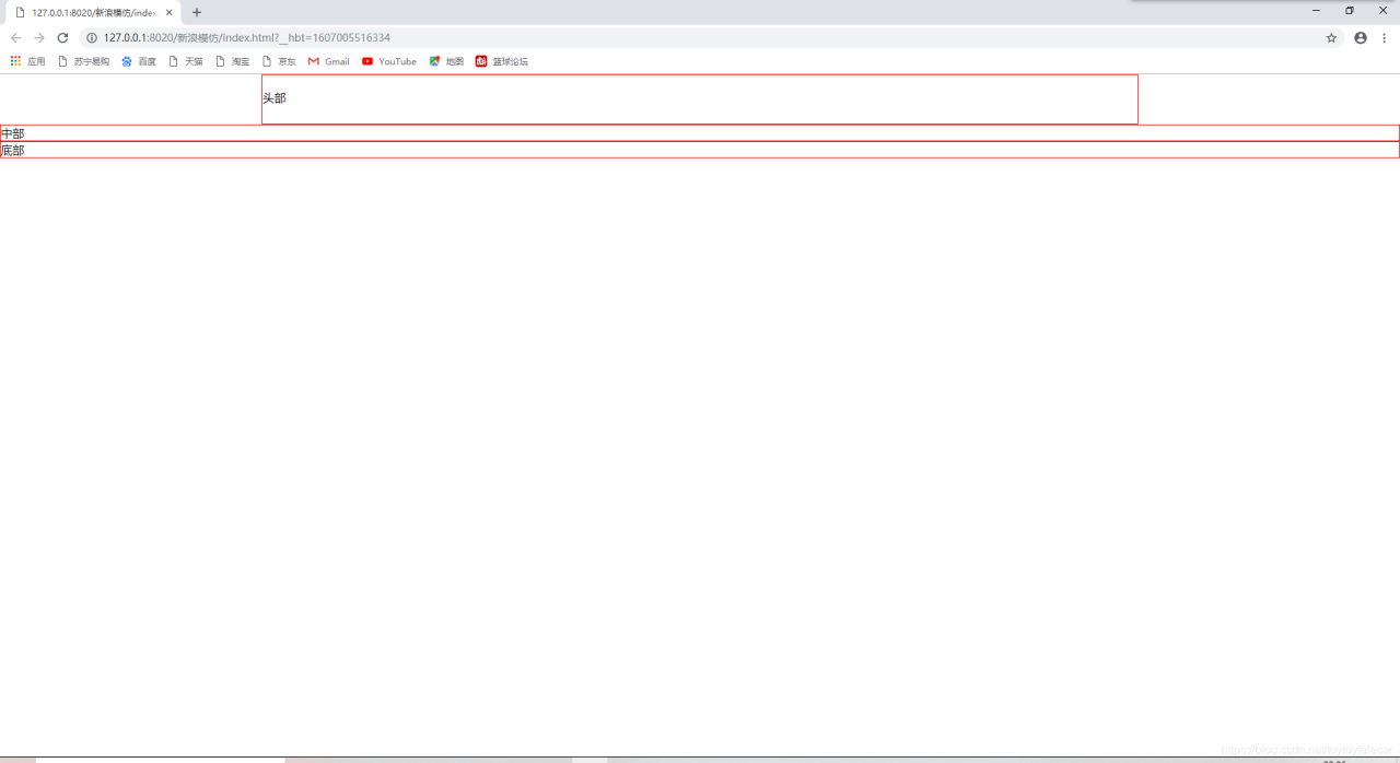
1.设置头部宽度:
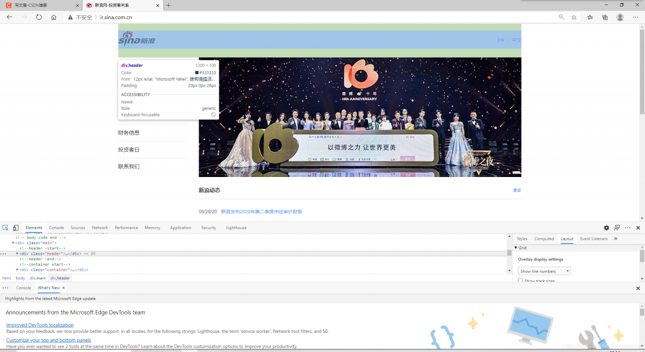
我扒了扒源代码,看到了头部部分的宽度是1200px,且头部部分是居中的,我们就在HTML中添加CSS样式设置:
<!DOCTYPE html>
<html>
	<head>
		<meta charset="utf-8" />
		<title></title>
	</head>
	<!--先勾勒出整个网页的结构-->
	<style>
		*{										/*通配符选择器清除默认值*/
			margin: 0px;
			padding: 0px;
		}
		#header,#container,#footer{				/*加上边框方便观看大致网页框架*/
			border: 1px solid red;
		}
			#header{
			width: 1200px;
			margin: 0 auto;					/*居中*/
		}
	</style>
	<body>

		<div id="header">头部</div>
		<div id="container">中部</div>
		<div id="footer">底部</div>
	</body>
</html>
执行效果:
可以看到头部已经全部居中、宽度也已经设置好了;
然而我们发现,我们执行的效果和原效果依然不太一样,我再次翻了翻源代码,发现我们还需要在头部设置一个padding宽度:
<!DOCTYPE html>
<html>
	<head>
		<meta charset="utf-8" />
		<title></title>
	</head>
	<!--先勾勒出整个网页的结构-->
	<style>
		*{										/*通配符选择器清除默认值*/
			margin: 0px;
			padding: 0px;
		}
		#header,#container,#footer{				/*加上边框方便观看大致网页框架*/
			border: 1px solid red;
		}
			#header{
			width: 1200px;
			margin: 0 auto;					/*居中*/
			padding-top: 20px;
			padding-bottom: 26px;
			padding-left: 0px;
			padding-right: 0px;
		}
	</style>
	<body>

		<div id="header">头部</div>
		<div id="container">中部</div>
		<div id="footer">底部</div>
	</body>
</html>
执行效果:
这样头部的基本样式就设置好了。
2.向head中插入内容
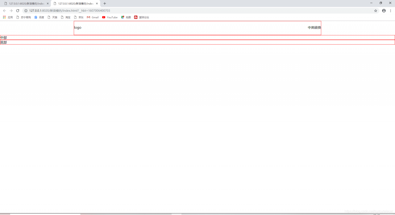
整个head由左边的logo和右边的超链接组成;我们不妨分析一下它是怎么实现的:
我分析,首先需要在head的<div>中加入两个子div分别代表logo和超链接,然后使用左右浮动的方式让他们分别分布在head的左右侧,最后消除浮动,使他们不脱离文档流,方便执行接下来的代码;
我们不妨在head的div中添加以下内容:
		<div id="header">

			<div id="logo">logo</div>
			<div id="interna">中英转换</div>
		</div>
然后在<style>里设置其左右浮动,最后在补一个空的div消除浮动;
全部代码为:
<!DOCTYPE html>
<html>
	<head>
		<meta charset="utf-8" />
		<title></title>
	</head>
	<!--先勾勒出整个网页的结构-->
	<style>
		*{										/*通配符选择器清除默认值*/
			margin: 0px;
			padding: 0px;
		}
		#header,#container,#footer{				/*加上边框方便观看大致网页框架*/
			border: 1px solid red;
		}
			#header{
			width: 1200px;
			margin: 0 auto;					/*居中*/
			padding-top: 20px;
			padding-bottom: 26px;
			padding-left: 0px;
			padding-right: 0px;
		}
			#header #logo{
			float: left;
		}
			#header #interna{
			float: right;
	</style>
	<body>

		<div id="header">

			<div id="logo">logo</div>
			<div id="interna">中英转换</div>
			<div style="clear: both;"></div>
		</div>
		</div>
		<div id="container">中部</div>
		<div id="footer">底部</div>
	</body>
</html>
实现效果:
接下来我们插入logo就行了,我们把logo在原网站上下载下来,并且添加一个img标签引入:
<!DOCTYPE html>
<html>
	<head>
		<meta charset="utf-8" />
		<title></title>
	</head>
	<!--先勾勒出整个网页的结构-->
	<style>
		*{										/*通配符选择器清除默认值*/
			margin: 0px;
			padding: 0px;
		}
		#header,#container,#footer{				/*加上边框方便观看大致网页框架*/
			border: 1px solid red;
		}
			#header{
			width: 1200px;
			margin: 0 auto;					/*居中*/
			padding-top: 20px;
			padding-bottom: 26px;
			padding-left: 0px;
			padding-right: 0px;
		}
			#header #logo{
			float: left;
		}
			#header #interna{
			float: right;
	</style>
	<body>

		<div id="header">

			<div id="logo">
				<img src="img/新浪网logo.png" />
			</div>
			<div id="interna">中英转换</div>
			<div style="clear: both;"></div>
		</div>
		</div>
		<div id="container">中部</div>
		<div id="footer">底部</div>
	</body>
</html>
插入logo后,我们需要把中英转换的那个标志也添加上:
中英转换的标志由文本和下划线组成,我们要在其<div>中添加以下内容:
			<div id="interna">
				<a href="http:\\www.sina.com">EN</a>
				<span>|</span>
				<a href="http:\\www.sina.com.cn">中文</a>
			</div>
这样就添加进去了内容,我们来看一下效果:
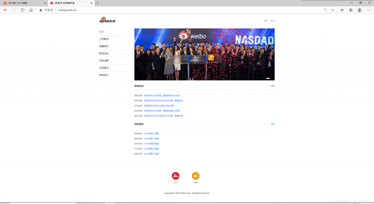
对比一下我们想要的效果可以看出我们的界面存在以下问题;
1.文本不垂直居中
2.文本颜色和大小不正确
3.文本具有下划线
我们逐级解决这几个问题:
文本不居中,我们可以在css样式中line-height,使它在标签中垂直居中;
颜色不正确,我们可以在<style>样式中添加颜色和大小;
具有下划线,那我们就添加text-decoration:none消除下划线。
<!DOCTYPE html>
<html>
	<head>
		<meta charset="utf-8" />
		<title></title>
	</head>
	<!--先勾勒出整个网页的结构-->
	<style>
		*{										/*通配符选择器清除默认值*/
			margin: 0px;
			padding: 0px;
		}
		#header,#container,#footer{				/*加上边框方便观看大致网页框架*/
			border: 1px solid red;
		}
		a{
			text-decoration: none;
			color: #4C92FC;
		}
		span{
			color: #e1e3e5;;
		}
		#header{
			width: 1200px;
			margin: 0 auto;					/*查看源代码的居中情况*/
			padding-top: 20px;
			padding-bottom: 26px;
			padding-left: 0px;
			padding-right: 0px;
		}
		#header #logo{
			float: left;
		}
		#header #interna{
			float: right;
			height: 47px;
			line-height: 47px;
			font-size: 14px;
		}

		#container{
			width: 1200px;
			margin: 0 auto;
		}
	</style>
	<body>

		<div id="header">
			<div id="logo">
				<img src="img/新浪网logo.png" />		<!--插入图片-->
			</div>
			<div id="interna">
				<a href="http:\\www.sina.com">EN</a>
				<span>|</span>
				<a href="http:\\www.sina.com.cn">中文</a>
			</div>
			<div style="clear: both;"></div>
		</div>
		<div id="container">中部</div>
		<div id="footer">底部</div>
	</body>
</html>
这样问题就解决了,我们的第一部分:head部分也就完成了。
2.container部分
我们通过对原页面的分析,可以得知container部分可以分为两部分:左边为导航栏,右边为内容;我们可以写两个<div>,并且使用浮动让他们分列在左右端:
<div id="container">
			<div id="nav"></div>
		    <div id="content"></div>
			<div style="clear: both;"></div>	<!--清除文档流里面的浮动,否则footer将无法正确显示-->
</div>
设置完大致格式后,我们需要往container里面添加style样式,具体设置一下每个div的宽度:
为了表达的比较清楚,我们都采用后代选择器:
         #container #nav {
			width: 200px;
			float: left;
		}

		#container #content {
			width: 960px;
			float: right;
		}
这样大致的格式就设置好了,下面我们需要往里面填充内容:
1.nav导航栏部分:
这部分代码我们之前已经模仿过,只需要把它拷贝至nav的<div>里面就可以;
导航栏代码:
<!DOCTYPE html>
<html>

	<head>
		<meta charset="UTF-8">
		<title></title>
		<style>
			ul {
				list-style: none;
			}

			li {
				border-bottom: 1px solid #e1e3e5;
				height: 49px;
				font: 12px/49px Arial, "Microsoft Yahei"
			}

			a {
				/*a标签不能继承父标签的属性,所以要单独写属*/
				text-decoration: none;
				color: rgb(51, 51, 51);
				font: 12px/49px Arial, "Microsoft Yahei"
			}

			#first {
				color: #4c92fc;
			}
		</style>
	</head>

	<body>
		<ul>
			<!--使用ul li实现导航栏-->
			<li>				<a id="first" href="http://www.baidu.com">首页</a>
			</li>
			<li>
				<a href="http://www.baidu.com">公司概况</a>
			</li>
			<li>
				<a href="http://www.baidu.com">股票咨询</a>
			</li>
			<li>
				<a href="http://www.baidu.com">新浪动态</a>
			</li>
			<li>
				<a href="http://www.baidu.com">财务信息</a>
			</li>
			<li>
				<a href="http://www.baidu.com">投资者日</a>
			</li>
			<li>
				<a href="http://www.baidu.com">联系我们</a>
			</li>
		</ul>
	</body>

</html>
这一部分需要注意的是拷贝的样式问题,需要规范一下样式标签,是他们都相同。
2.content内容部分
内容部分我们经过分析,主要为以下两部分:
1.轮播图
2.新闻栏
1.轮播图
动态的轮播图需要使用javascript,这里我们只是用了HTML和CSS,所以无法做出动态的效果,所以我们只做一个大致轮廓,这里就不再赘述了。
大致轮廓的代码:
		#container #content #image-scroll #img-btns {
			position: absolute;
			bottom: 10px;
			right: 4px;
		}

		#container #content #image-scroll .img-btn {
			display: inline-block;
			width: 20px;
			height: 5px;
			border: 1px solid #ffffff;
		}

        <div id="image-scroll" style="position: relative;">
					<img src="img/背景图.jpg" width="960px" />
					<div id="img-btns">
						<span class="img-btn" style="background-color: #fff;"></span>
						<span class="img-btn" style="background: #000;opacity: .2"></span>
						<span class="img-btn" style="background: #000;opacity: .2"></span>
					</div>
				</div>
2.新闻栏
新闻栏的布局非常明显,上方是一个标题头,下面使用无序列表。
实现新闻栏需要注意的点是超链接与日期如何分开;我们只需要在<div>包裹中加入<span>标签即可。
			#container #content .news-title {
			line-height: 50px;
			height: 50px;
			border-bottom: 1px solid #e1e3e5;
			padding-top: 15px;
		}

		#container #content .news-title .text {
			float: left;
			color: #323232;
			font-size: 16px;
			font-weight: bold;
		}

		#container #content .news-title .more {
			float: right;
		}

		#container #content .news-title .more a {
			color: #4c92fc;
			font-size: 12px;
			text-decoration: none;
		}

		#container #content a:hover {
			text-decoration: underline;
		}
		#container #content ul{
			padding: 20px 0 0 0;
		}
		#container #content ul li{
			list-style: none;
			font-size: 14px;
			height: 35px;
			line-height: 35px;
		}
		#container #content ul li .date{
			color: #575859;
    		padding-right: 12px;
		}
		#container #content ul li a{
			color: #4c92fc;
			text-decoration: none;
		}
			<div class="news-title">
					<span class="text">新浪动态</span>
					<span class="more">
						<a href="http://ir.sina.com.cn/press_releases.shtml">更多</a>
					</span>
				</div>
				<ul>
					<li>
						<span class="date">09/28/20</span>
						<a href="https://finance.sina.com.cn/stock/usstock/c/2020-09-28/doc-iivhuipp6983545.shtml" target="_blank">新浪发布2020年第二季度未经审计财报</a>
					</li>
					<li>
						<span class="date">09/23/20</span>
						<a href="https://finance.sina.com.cn/stock/usstock/c/2020-09-23/doc-iivhuipp6026575.shtml?cref=cj" target="_blank">新浪将于9月28日发布2020年第二季度财报</a>
					</li>
					<li>
						<span class="date">07/06/20</span>
						<a href="https://finance.sina.com.cn/stock/usstock/c/2020-07-06/doc-iirczymm0877495.shtml" target="_blank">新浪宣布收到非约束性私有化要约</a>
					</li>
					<li>
						<span class="date">05/19/20</span>
						<a href="https://finance.sina.com.cn/stock/usstock/c/2020-05-19/doc-iircuyvi3943233.shtml" target="_blank">新浪发布2020年第一季度未经审计财报</a>
					</li>
					<li>
						<span class="date">05/12/20</span>
						<a href="https://tech.sina.com.cn/i/2020-05-12/doc-iirczymk1249146.shtml" target="_blank">新浪将于5月19日发布2020年第一季度财报</a>
					</li>
				</ul>
3.footer部分
footer部分由两个图片链接组成,附带下面的文字,我们经过分析,图片链接与下面的文字是一个整体,最后一行的注释,我们只需要再加一个<p>即可。
我们着重分析一下如何写这两个图片链接:
每一个图片链接都需要一个<div>标签包裹,如果我想让他在一行上显示,就必须要在<style>上添加display:inline-block;<div>标签里面包裹的<span>标签,目的是在图片下方加上文字,我们若想让文字显示在下方,就需要添加display:block样式将行内元素转化为块级元素,然后再添加margin、padding、文字颜色等格式即可。
完整代码:
<!DOCTYPE html>
<html>

	<head>
		<meta charset="utf-8" />
		<title></title>
	</head>
	<!--先勾勒出整个网页的结构-->
	<style>
		* {
			/*通配符选择器清除默认值*/
			margin: 0px;
			padding: 0px;
		}

		#header {
			width: 1200px;
			margin: 0 auto;
			/*查看源代码的居中情况*/
			padding-top: 20px;
			padding-bottom: 26px;
			padding-left: 0px;
			padding-right: 0px;
		}

		#header #logo {
			float: left;
		}

		#header #interna {
			float: right;
			height: 47px;
			line-height: 47px;
		}

		#header #interna a {
			text-decoration: none;
			color: #4C92FC;
			font-size: 14px;
			font-family: Arial, "Microsoft Yahei;

		}

		#header #interna span {
			margin: 0 10px;
			color: #e1e3e5;
			;
		}

		#container {
			width: 1200px;
			margin: 0 auto;
		}

		#container #nav {
			width: 200px;
			float: left;
		}

		#container #content {
			width: 960px;
			float: right;
		}

		#container #nav ul {
			list-style: none;
		}

		#container #nav li {
			border-bottom: 1px solid #e1e3e5;
			height: 49px;
		}

		#container #nav a {
			text-decoration: none;
			color: rgb(51, 51, 51);
			font: 16px Arial, "Microsoft Yahei"
		}

		#container #nav #first {
			color: #4c92fc;
		}

		#container #content #image-scroll #img-btns {
			position: absolute;
			bottom: 10px;
			right: 4px;
		}

		#container #content #image-scroll .img-btn {
			display: inline-block;
			width: 20px;
			height: 5px;
			border: 1px solid #ffffff;
		}

		#container #content .news-title {
			line-height: 50px;
			height: 50px;
			border-bottom: 1px solid #e1e3e5;
			padding-top: 15px;
		}

		#container #content .news-title .text {
			float: left;
			color: #323232;
			font-size: 16px;
			font-weight: bold;
		}

		#container #content .news-title .more {
			float: right;
		}

		#container #content .news-title .more a {
			color: #4c92fc;
			font-size: 12px;
			text-decoration: none;
		}

		#container #content a:hover {
			text-decoration: underline;
		}
		#container #content ul{
			padding: 20px 0 0 0;
		}
		#container #content ul li{
			list-style: none;
			font-size: 14px;
			height: 35px;
			line-height: 35px;
		}
		#container #content ul li .date{
			color: #575859;
    		padding-right: 12px;
		}
		#container #content ul li a{
			color: #4c92fc;
			text-decoration: none;
		}
		#footer{
			border-top: 1px solid #e1e3e5;
    		padding: 30px 0 50px 0;
    		text-align: center;
    		margin: 0 auto;
		}
		#footer .fo-con {
    		display: inline-block;
    		vertical-align: top;
    		padding: 0 50px 0 32px;
		}
		#footer .icon-sina {
    		width: 52px;
    		height: 52px;
        	background: url(http://n2.sinaimg.cn/tech/ir/imges/sina.png) no-repeat 100% 100%;					/*没有搞懂什么意思*/
    	}
    	#footer .icon-weibo{
   			width: 52px;
    		height: 52px;
    		background: url(http://n2.sinaimg.cn/tech/ir/imges/weibo.png) no-repeat 100% 100%;
    	}
    	#footer .fo-con span {
    		display: block;
    		font-size: 12px;
    		color: #707173;
    		padding-top: 10px;
    	}
    	#footer p {
    		padding-top: 50px;
    		font-size: 14px;
    		color: #575859;
    	}
	</style>

	<body>

		<div id="header">
			<div id="logo">
				<a href="http:\\www.sina.com.cn"><img src="img/新浪网logo.png" /></a>
				<!--插入图片-->
			</div>
			<div id="interna">
				<a href="http:\\www.sina.com">EN</a>
				<span>|</span>
				<a href="http:\\www.sina.com.cn">中文</a>
			</div>
			<div style="clear: both;"></div>
		</div>
		<div id="container">
			<div id="nav">
				<ul>
					<!--使用ul li实现导航栏-->
					<li>
						<a id="first" href="http://www.baidu.com">首页</a>
					</li>
					<li>
						<a href="http://www.baidu.com">公司概况</a>
					</li>
					<li>
						<a href="http://www.baidu.com">股票资讯</a>
					</li>
					<li>
						<a href="http://www.baidu.com">新浪动态</a>
					</li>
					<li>
						<a href="http://www.baidu.com">财务信息</a>
					</li>
					<li>
						<a href="http://www.baidu.com">投资者日</a>
					</li>
					<li>
						<a href="http://www.baidu.com">联系我们</a>
					</li>
				</ul>
			</div>

			<div id="content">

				<div id="image-scroll" style="position: relative;">
					<img src="img/背景图.jpg" width="960px" />
					<div id="img-btns">
						<span class="img-btn" style="background-color: #fff;"></span>
						<span class="img-btn" style="background: #000;opacity: .2"></span>
						<span class="img-btn" style="background: #000;opacity: .2"></span>
					</div>
				</div>
				<div class="news-title">
					<span class="text">新浪动态</span>
					<span class="more">
						<a href="http://ir.sina.com.cn/press_releases.shtml">更多</a>
					</span>
				</div>
				<ul>
					<li>
						<span class="date">09/28/20</span>
						<a href="https://finance.sina.com.cn/stock/usstock/c/2020-09-28/doc-iivhuipp6983545.shtml" target="_blank">新浪发布2020年第二季度未经审计财报</a>
					</li>
					<li>
						<span class="date">09/23/20</span>
						<a href="https://finance.sina.com.cn/stock/usstock/c/2020-09-23/doc-iivhuipp6026575.shtml?cref=cj" target="_blank">新浪将于9月28日发布2020年第二季度财报</a>
					</li>
					<li>
						<span class="date">07/06/20</span>
						<a href="https://finance.sina.com.cn/stock/usstock/c/2020-07-06/doc-iirczymm0877495.shtml" target="_blank">新浪宣布收到非约束性私有化要约</a>
					</li>
					<li>
						<span class="date">05/19/20</span>
						<a href="https://finance.sina.com.cn/stock/usstock/c/2020-05-19/doc-iircuyvi3943233.shtml" target="_blank">新浪发布2020年第一季度未经审计财报</a>
					</li>
					<li>
						<span class="date">05/12/20</span>
						<a href="https://tech.sina.com.cn/i/2020-05-12/doc-iirczymk1249146.shtml" target="_blank">新浪将于5月19日发布2020年第一季度财报</a>
					</li>
				</ul>
				<div class="news-title">
					<span class="text">财务报告</span>
					<span class="more">
						<a href="http://ir.sina.com.cn/press_releases.shtml">更多</a>
					</span>
				</div>
				<ul>
					<li>
						<span class="date">09/28/20</span>
						<a href="https://finance.sina.com.cn/stock/usstock/c/2020-09-28/doc-iivhuipp6983545.shtml" target="_blank">2020年第二季度</a>
					</li>
					<li>
						<span class="date">05/19/20</span>
						<a href="https://finance.sina.com.cn/stock/usstock/c/2020-05-19/doc-iircuyvi3943233.shtml" target="_blank">2020年第一季度</a>
					</li>
					<li>
						<span class="date">02/18/20</span>
						<a href="https://tech.sina.com.cn/i/2020-02-18/doc-iimxyqvz3877623.shtml" target="_blank">2019年第四季度</a>
					</li>
					<li>
						<span class="date">11/14/19</span>
						<a href="https://tech.sina.com.cn/i/2019-11-14/doc-iihnzahi0863074.shtml" target="_blank">2019年第三季度</a>
					</li>
					<li>
						<span class="date">08/19/19</span>
						<a href="https://tech.sina.com.cn/i/2019-08-19/doc-ihytcern1956823.shtml" target="_blank">2019年第二季度</a>
					</li>
				</ul>
			</div>
			<div style="clear: both;"></div>						<!--清除文档流里面的浮动,否则footer将无法正确显示-->
		</div>
		<div id="footer">
				<div class="fo-con">
					<a href="http://www.sina.com.cn/" target="_blank">
						<div class="icon-sina"></div>
					</a>
						<span>SINA</span>
				</div>
				<div class="fo-con">
					<a href="https://weibo.com/" target="_blank">
						<div class="icon-weibo"></div>
					</a>
					<span>Weibo</span>
				</div>
				<p>Copyright © 2020 SINA Corp. All Rights Reserved.</p>
		</div>
	</body>

</html>
最后实现效果: