空间位移:使用translate实现元素空间位移效果
语法l transform: translate3d(x, y, z);l transform: translateX(值);l transform: translateY(值);l transform: translateZ(值);l使用 perspective 属性实现 透视 效果取值( 正负 均可)l 像素单位数值l 百分比取值:像素单位数值, 数值一般在 800 – 1200Z轴是视线方向,移动效果应该是距离的 远或近 , 电脑屏幕是平面,默认无法观察远近效果perspective只增加近大远小、近实远虚的视觉效果
<!DOCTYPE html>
<html lang="en">
<head>
    <meta charset="UTF-8">
    <meta http-equiv="X-UA-Compatible" content="IE=edge">
    <meta name="viewport" content="width=device-width, initial-scale=1.0">
    <title>空间位移</title>
    <style>
        body{
            perspective: 200px;
        }
        .box{
            width: 200px;
            height: 200px;
            margin: 100px auto;
            background-color: antiquewhite;
            transition: all 8s;
        }
        .box:hover{
            /* transform: translate3d(50px,100px,200px);  */
            /* transform: translateX(100px);
            transform: translateY(100px); */
            transform: translateZ(-500px);
            transform: translateZ(500px);
            /* transform:translate3d(100px); */
        }
    </style>
</head>
<body>
        <!-- transform: translate3d(x, y, z);-->

    <div class="box"></div>
</body>
</html>
空间旋转rotate
判断旋转方向: 左手握住旋转轴, 拇指指向正值方向, 手指弯曲方向为旋转正值方向
<!DOCTYPE html>
<html lang="en">
<head>
    <meta charset="UTF-8">
    <meta http-equiv="X-UA-Compatible" content="IE=edge">
    <meta name="viewport" content="width=device-width, initial-scale=1.0">
    <title>空间旋转</title>
    <style>
        .box{
            width: 300px;
            margin: 100px auto;
            /* perspective: 1000px; */
        }
        img{
            width: 300px;
            transition: all 2s;
        }
        /* .box img:hover{
            transform: rotateZ(360deg);
        } */
      /*    transform: rotateX(60deg);  X旋转 */
         /*    transform: rotateY(60deg);  Y旋转 */
         /*    transform: rotateY(60deg);  Y旋转 */
        .box img:hover{
            transform: rotateY(-60deg);
        }
    </style>
</head>
<body>
    <div class="box">
        <img src="./images/hero.jpeg" alt="" >
    </div>

</body>
</html>使用rotate实现元素空间旋转效果
rotate3d(x, y, z, 角度度数) :用来设置自定义旋转轴的位置及旋转的角度
x,y,z 取值为0-1之间的数字
立体呈现使用transform-style: preserve-3d呈现立体图形
<!DOCTYPE html>
<html lang="en">
<head>
    <meta charset="UTF-8">
    <meta http-equiv="X-UA-Compatible" content="IE=edge">
    <meta name="viewport" content="width=device-width, initial-scale=1.0">
    <title>立体呈现</title>
    <style>
        .cube {
            position: relative;
            width: 200px;
            height: 200px;
            margin: 100px auto;
            background-color: pink;
            transition: all 2s;
            transform-style: preserve-3d;
        }

        .cube div {
            position: absolute;
            left: 0;
            top: 0;
            width: 200px;
            height: 200px;
        }

        .front {
            background-color: orange;
            /* 向我走近200px */
            transform: translateZ(200px);
        }

        .back {
            background-color: green;
        }

        /* cube hover 为了看空间感效果 */
        .cube:hover {
            transform: rotateY(90deg);
        }
    </style>
</head>
<body>
    <div class="cube">
        <div class="front">前面</div>
        <div class="back">后面</div>
    </div>
</body>
</html>使用scale实现空间缩放效果
l 语法Ø transform: scaleX(倍数);Ø transform: scaleY(倍数);Ø transform: scaleZ(倍数);Ø transform: scale3d(x, y, z);
<!DOCTYPE html>
<html lang="en">

<head>
    <meta charset="UTF-8">
    <meta name="viewport" content="width=device-width, initial-scale=1.0">
    <title>3D导航</title>
    <style>
        ul {
            margin: 0;
            padding: 0;
            list-style: none;
        }

        .navs {
            width: 300px;
            height: 40px;
            margin: 50px auto;
        }

        .navs li {
            position: relative;
            float: left;
            width: 100px;
            height: 40px;
            line-height: 40px;
            transition: all .5s;
            transform-style: preserve-3d;

            /* 旋转: 让大家在写代码的过程中看到立体盒子 */
            /* transform: rotateX(-60deg) rotateY(20deg) ; */

            /* 测试缩放效果 */
            /* transform: scale3d(0.5, 1.1, 2); */
        }

        .navs li a {
            position: absolute;
            left: 0;
            top: 0;
            display: block;
            width: 100%;
            height: 100%;
            text-align: center;
            text-decoration: none;
            color: #fff;
        }

        .navs li a:first-child {
            background-color: green;
            transform: translateZ(20px);
        }

        .navs li a:last-child {
            background-color: orange;
            /* 躺平x轴旋转  立方体的顶部,位移z(确保看到这个盒子) */
            transform: rotateX(90deg) translateZ(20px);
        }

        /* li:hover 立方体旋转 */
        .navs li:hover {
            transform: rotateX(-90deg);
        }
    </style>
</head>

<body>
    <div class="navs">
        <ul>
            <li>
                <a href="#">首页</a>
                <a href="#">Index</a>
            </li>
            <li>
                <a href="#">登录</a>
                <a href="#">Login</a>
            </li>
            <li>
                <a href="#">注册</a>
                <a href="#">Register</a>
            </li>
        </ul>
    </div>
</body>

</html>
CSS动画
使用 animation 添加 动画 效果动画效果:实现 多个状态 间的变化过程,动画 过程可控 (重复播放、最终画面、是否暂停)过渡可以 实现2个状态间的变化过程动画的本质是快速切换大量图片时在人脑中形成的具有 连续性的画面l 构成动画的最小单元: 帧或动画帧
<!DOCTYPE html>
<html lang="en">
<head>
    <meta charset="UTF-8">
    <meta http-equiv="X-UA-Compatible" content="IE=edge">
    <meta name="viewport" content="width=device-width, initial-scale=1.0">
    <title>01-动画实现步骤</title>
    <style>
        .box{
            width: 200px;
            height: 100px;
            background-color: pink;
            /*使用动画*/
            /* animation:change 2s linear; */
            /* animation: change 1s steps(3); 分布动画分成几等分steps */
            /*3 重复三次播放*/
            /* animation: change 2s  steps(2) 1s 3; */
            /*无线循环infinite*/
              /*无线循环infinite 动画方向 alternate*/
            animation: changes 1s infinite alternate;
            /*执行完毕状态*/
            /* animation:  change 1s backwards;默认值 动画停留在最初的状态 */
            /* animation: changes 1s forwards;/*动画停留在结尾状态forwards/ */
        }
        /* 定义动画 改变大小 */
        @keyframes change {
            from{
               width: 200px;
            }
            to{
              width: 600px;
            }

        }
         /* 二. 定义动画:200 到 500*300 到 800*500 */
        /* 百分比指的是动画总时长的占比 */
        @keyframes changes {
            0% {
                width: 200px;
            }
            50% {
                width: 500px;
                height: 300px;
            }
            100% {
                width: 800px;
                height: 500px;
            }
        }
    </style>
</head>
<body>
    <div class="box"></div>
</body>
</html>注意:Ø 动画名称和动画时长必须赋值Ø 取值不分先后顺序Ø 如果有2个时间值,第一个时间表示动画时长,第二个时间表示延迟时间
使用animation相关属性控制动画执行过程
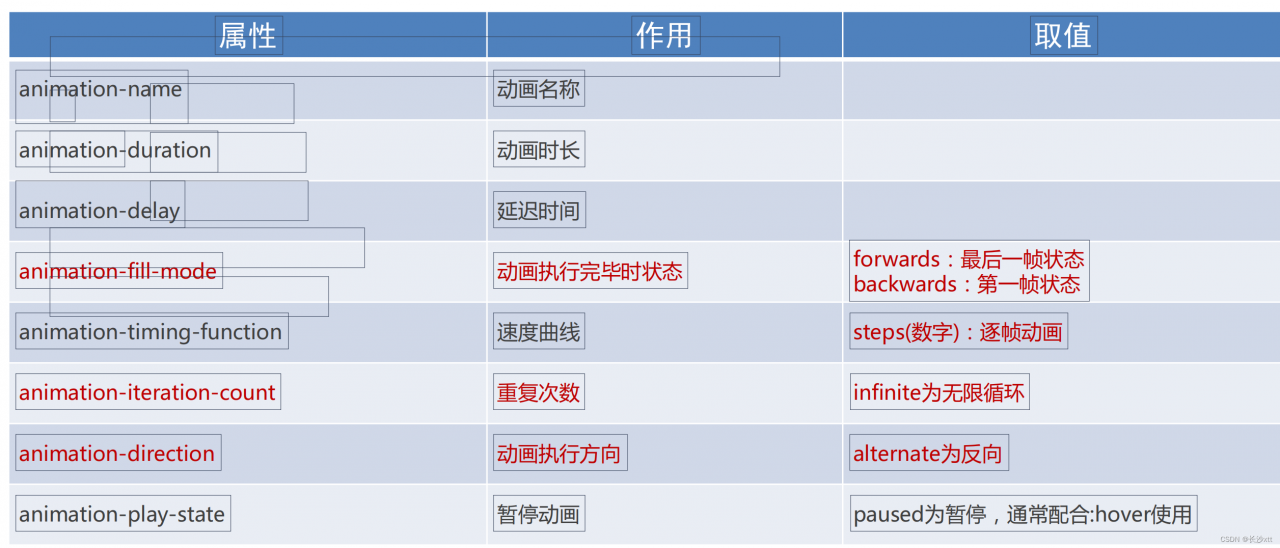
逐帧动画实现 使用steps实现逐帧动画

<!DOCTYPE html>
<html lang="en">
<head>
    <meta charset="UTF-8">
    <meta http-equiv="X-UA-Compatible" content="IE=edge">
    <meta name="viewport" content="width=device-width, initial-scale=1.0">
    <title>逐帧动画</title>
    <style>
        .box{
            width: 140px;
            height: 140px;

            background-image:url(./images/bg.png);
            animation:
            move 2s steps(12) infinite,
            run 8s forwards

        }
        @keyframes move {
            /* from{
                background-position: 0 0;
            } */
            to{
                      /* 1680: 精灵图的宽度 */
                background-position: -1680px 0;
            }

        }
         /* 定义一个盒子移动的动画  800px */
    @keyframes run {
      /* 动画的开始状态和盒子的默认样式相同的, 可以省略开始状态的代码 */
      /* from {
        transform: translateX(0);
      } */
      to {
        transform: translateX(800px);
      }
    }

    </style>
</head>
<body>
    <div class="box"></div>
</body>
</html>
走马灯效果
<!DOCTYPE html>
<html lang="en">
  <head>
    <meta charset="UTF-8" />
    <meta name="viewport" content="width=device-width, initial-scale=1.0" />
    <title>Document</title>
    <style>
      * {
        padding: 0;
        margin: 0;
      }
      li {
        list-style: none;
      }

      img {
        width: 200px;
      }

      .box {
        width: 600px;
        height: 112px;
        border: 5px solid #000;
        margin: 100px auto;
        overflow: hidden;
      }

      .box ul {
        width: 2000px;
        animation: move 5s infinite linear;
      }

      .box li {
        float: left;
      }

      /* 定义动画:位移, ul 左侧使用  x -1400  */
      @keyframes move {
        to {
          transform: translateX(-1400px);
        }
      }

      /* 用户鼠标移入box,动画暂停 */
      .box:hover ul {
        animation-play-state: paused;
      }

    </style>
  </head>
  <body>
    <div class="box">
      <ul>
        <li><img src="./images/zm/1.jpg" alt="" /></li>
        <li><img src="./images/zm/2.jpg" alt="" /></li>
        <li><img src="./images/zm/3.jpg" alt="" /></li>
        <li><img src="./images/zm/4.jpg" alt="" /></li>
        <li><img src="./images/zm/5.jpg" alt="" /></li>
        <li><img src="./images/zm/6.jpg" alt="" /></li>
        <li><img src="./images/zm/7.jpg" alt="" /></li>

        <!-- 第567移动的时候,显示区域不能留白 -->
        <li><img src="./images/zm/1.jpg" alt="" /></li>
        <li><img src="./images/zm/2.jpg" alt="" /></li>
        <li><img src="./images/zm/3.jpg" alt="" /></li>
      </ul>
    </div>
  </body>
</html>
版权声明:本文为weixin_40746230原创文章,遵循CC 4.0 BY-SA版权协议,转载请附上原文出处链接和本声明。