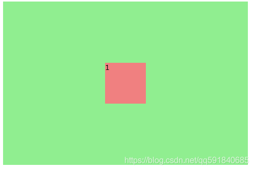
一、位于父类左上角
图片演示
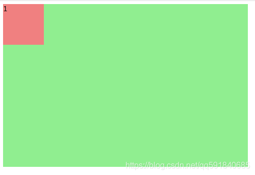
html代码
    <div class="div-big">
		<div class="div-small">1</div>
	</div>
css代码
/* 父类 */
.div-big{
	width: 600px;
	height: 400px;
	background-color: lightgreen;/*绿背景色*/
}
/* 子类 */
.div-big .div-small{
	width: 100px;
	height: 100px;
	background-color: lightcoral;/*红背景色*/
}
一、位于父类上部水平居中
图片演示
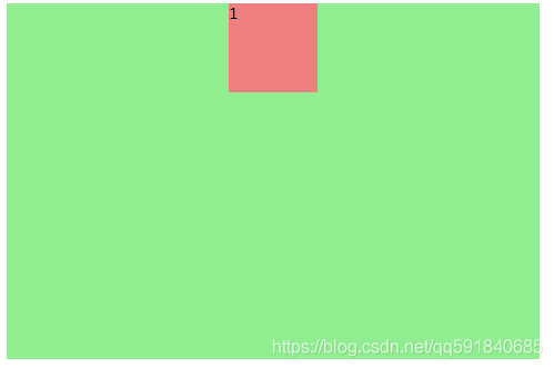
html代码
    <div class="div-big">
		<div class="div-small">1</div>
	</div>
css代码
/* 父类 */
.div-big{
width: 600px;
height: 400px;
background-color: lightgreen;/*绿背景色*/
}
/* 子类 */
.div-big .div-small{
width: 100px;
height: 100px;
background-color: lightcoral;/*红背景色*/
margin: 0 auto;/*重要*/ /*水平居中*/
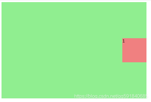
}一、位于父类右上角
图片演示
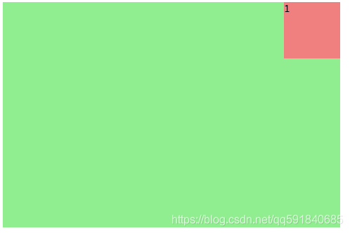
html代码
	<div class="div-big">
		<div class="div-small">1</div>
	</div>
css代码
/* 父类 */
.div-big{
	width: 600px;
	height: 400px;
	background-color: lightgreen;/*绿背景色*/
	display: flex;/*重要*/ /*横向排列*/
	justify-content:flex-end;/*重要*/ /*在结尾处*/
}
/* 子类 */
.div-big .div-small{
	width: 100px;
	height: 100px;
	background-color: lightcoral;/*红背景色*/
}
一、位于父类左侧垂直居中
图片演示
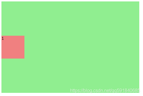
html代码
	<div class="div-big">
		<div class="div-small">1</div>
	</div>
css代码
/* 父类 */
.div-big{
	width: 600px;
	height: 400px;
	background-color: lightgreen;/*绿背景色*/
	display: flex;/*重要*/ /*横向排列*/
	align-items: center; /*重要*/ /*子类居中*/
}
/* 子类 */
.div-big .div-small{
	width: 100px;
	height: 100px;
	background-color: lightcoral;/*红背景色*/
}
一、位于父类中心
图片演示
html代码
	<div class="div-big">
		<div class="div-small">1</div>
	</div>
css代码(方法一)
/* 父类 */
.div-big{
	width: 600px;
	height: 400px;
	background-color: lightgreen;/*绿背景色*/
	display: flex;/*重要*/ /*横向排列*/
	align-items: center; /*重要*/ /*子类居中*/
}
/* 子类 */
.div-big .div-small{
	width: 100px;
	height: 100px;
	background-color: lightcoral;/*红背景色*/
	margin: 0 auto; /*重要*/ /*子类居中*/
}
css代码(方法二)
/* 父类 */
.div-big{
	width: 600px;
	height: 400px;
	background-color: lightgreen;/*绿背景色*/
	display: flex;/*重要*/ /*横向排列*/
}
/* 子类 */
.div-big .div-small{
	width: 100px;
	height: 100px;
	background-color: lightcoral;/*红背景色*/
	margin: 0 auto; /*重要*/ /*子类居中*/
	align-self: center; /*重要*/ /*子类居中*/
}
一、位于父类右侧垂直居中
图片演示
html代码
	<div class="div-big">
		<div class="div-small">1</div>
	</div>
css代码
/* 父类 */
.div-big{
	width: 600px;
	height: 400px;
	background-color: lightgreen;/*绿背景色*/
	display: flex;/*重要*/ /*横向排列*/
	align-items: center;/*重要*/ /*垂直方向居中*/
	justify-content: flex-end;/*重要*/ /*水平方向底部*/
}
/* 子类 */
.div-big .div-small{
	width: 100px;
	height: 100px;
	background-color: lightcoral;/*红背景色*/
}
一、位于父类左下角
图片演示
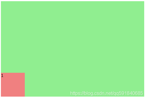
html代码
	<div class="div-big">
		<div class="div-small">1</div>
	</div>
css代码
/* 父类 */
.div-big{
	width: 600px;
	height: 400px;
	background-color: lightgreen;/*绿背景色*/
	display: flex;/*重要*/ /*横向排列*/
	align-items: flex-end;/*重要*/ /*横向上底部*/
}
/* 子类 */
.div-big .div-small{
	width: 100px;
	height: 100px;
	background-color: lightcoral;/*红背景色*/
}
一、位于父类下部水平居中
图片演示
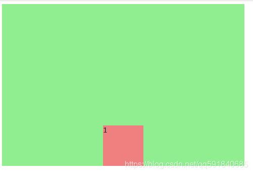
html代码
	<div class="div-big">
		<div class="div-small">1</div>
	</div>
css代码
/* 父类 */
.div-big{
	width: 600px;
	height: 400px;
	background-color: lightgreen;/*绿背景色*/
	display: flex;/*重要*/ /*横向排列*/
	align-items: flex-end;/*重要*/ /*横向上底部*/
}
/* 子类 */
.div-big .div-small{
	width: 100px;
	height: 100px;
	background-color: lightcoral;/*红背景色*/
	margin: 0 auto;/*重要*/ /*水平居中*/
}
一、位于父类右下角
图片演示
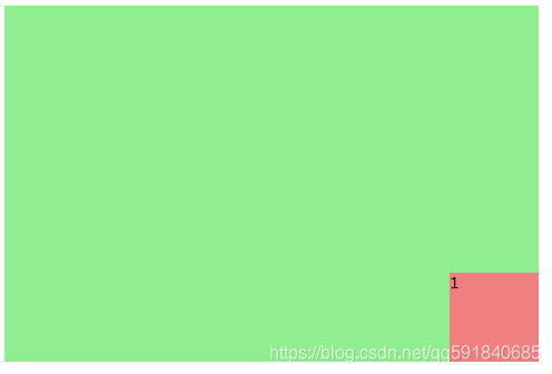
html代码
	<div class="div-big">
		<div class="div-small">1</div>
	</div>
css代码
/* 父类 */
.div-big{
	width: 600px;
	height: 400px;
	background-color: lightgreen;/*绿背景色*/
	display: flex;/*重要*/ /*横向排列*/
	align-items: flex-end;/*重要*/ /*垂直方向底部*/
	justify-content: flex-end;/*重要*/ /*水平方向底部*/
}
/* 子类 */
.div-big .div-small{
	width: 100px;
	height: 100px;
	background-color: lightcoral;/*红背景色*/
}
相对绝对实现上下左右水平居中垂直居中请看下一篇文章。
CSS布局——一个DIV上下左右水平居中垂直居中布局(relative-absolute)_qq591840685的专栏-CSDN博客
版权声明:本文为qq591840685原创文章,遵循CC 4.0 BY-SA版权协议,转载请附上原文出处链接和本声明。