html
<body>
    <div class="box">
        <ul class="minbox">
            <li></li>
            <li></li>
            <li></li>
            <li></li>
            <li></li>
            <li></li>
        </ul>
        <ol class="maxbox">
            <li></li>
            <li></li>
            <li></li>
            <li></li>
            <li></li>
            <li></li>
        </ol>
    </div>
</body>
css
<style>
        * {
            margin: 0px;
            padding: 0px;
        }

        body {
            background: black;
        }

        .box {
            position: relative;
            width: 400px;
            height: 400px;
            margin: 100px auto;
            transform-style: preserve-3d;
            animation: run 5s linear infinite;
        }

        .minbox li {
            list-style: none;
            width: 100px;
            height: 100px;
            position: absolute;
            top: 0px;
            bottom: 0px;
            left: 0px;
            right: 0px;
            margin: auto;
        }

        .minbox li:nth-child(1) {
            transform: translateY(-50px) rotateX(90deg);
            background: url(./image/相册01.jpg) no-repeat;
            background-size: 100% 100%;
        }

        .minbox li:nth-child(2) {
            transform: translateY(50px) rotateX(90deg);
            background: url(./image/相册02.jpg) no-repeat;
            background-size: 100% 100%;
        }

        .minbox li:nth-child(3) {
            transform: translateX(-50px) rotateY(90deg);
            background: url(./image/相册03.jpg) no-repeat;
            background-size: 100% 100%;
        }

        .minbox li:nth-child(4) {
            transform: translateX(50px) rotateY(90deg);
            background: url(./image/相册04.jpg) no-repeat;
            background-size: 100% 100%;
        }

        .minbox li:nth-child(5) {
            transform: translateZ(50px);
            background: url(./image/相册05.jpg) no-repeat;
            background-size: 100% 100%;
        }

        .minbox li:nth-child(6) {
            transform: translateZ(-50px);
            background: url(./image/相册06.jpg) no-repeat;
            background-size: 100% 100%;
        }

        .maxbox li {
            position: absolute;
            width: 200px;
            height: 200px;
            top: 0px;
            bottom: 0px;
            left: 0px;
            right: 0px;
            margin: auto;
            opacity: 0.2;
            transition: all 1s;
        }

        .maxbox li:nth-child(1) {
            transform: translateY(-100px) rotateX(90deg);
            background: url(./image/相册1.jpg) no-repeat;
            background-size: 100% 100%;
        }

        .maxbox li:nth-child(2) {
            transform: translateY(100px) rotateX(90deg);
            background: url(./image/相册2.jpg) no-repeat;
            background-size: 100% 100%;
        }

        .maxbox li:nth-child(3) {
            transform: translateX(-100px) rotateY(90deg);
            background: url(./image/相册3.jpg) no-repeat;
            background-size: 100% 100%;
        }

        .maxbox li:nth-child(4) {
            transform: translateX(100px) rotateY(90deg);
            background: url(./image/相册4.jpg) no-repeat;
            background-size: 100% 100%;
        }

        .maxbox li:nth-child(5) {
            transform: translateZ(100px);
            background: url(./image/相册5.jpg) no-repeat;
            background-size: 100% 100%;
        }

        .maxbox li:nth-child(6) {
            transform: translateZ(-100px);
            background: url(./image/相册6.jpg) no-repeat;
            background-size: 100% 100%;
        }

        .box:hover .maxbox li:nth-child(1) {
            transform: translateY(-300px) rotateX(90deg);
            width: 400px;
            height: 400px;
            opacity: 0.8;
        }

        .box:hover .maxbox li:nth-child(2) {
            transform: translateY(300px) rotateX(90deg);
            width: 400px;
            height: 400px;
            opacity: 0.8;
        }

        .box:hover .maxbox li:nth-child(3) {
            transform: translateX(-300px) rotateY(90deg);
            width: 400px;
            height: 400px;
            opacity: 0.8;
        }

        .box:hover .maxbox li:nth-child(4) {
            transform: translateX(300px) rotateY(90deg);
            width: 400px;
            height: 400px;
            opacity: 0.8;
        }

        .box:hover .maxbox li:nth-child(5) {
            transform: translateZ(300px);
            width: 400px;
            height: 400px;
            opacity: 0.8;
        }

        .box:hover .maxbox li:nth-child(6) {
            transform: translateZ(-300px);
            width: 400px;
            height: 400px;
            opacity: 0.8;
        }

        @keyframes run {
            to {
                transform: rotateX(13deg) rotateY(0deg);
            }
            from {
                transform: rotateX(13deg) rotateY(-360deg);
            }
        }
    </style>
详细地址:https://www.zhihu.com/question/436032117/answer/1641089352
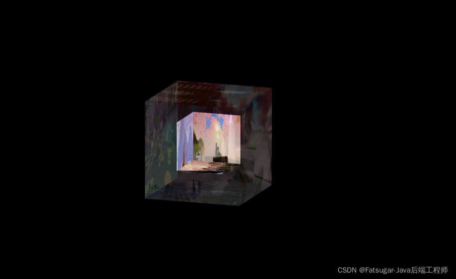
效果图