1. 平面转换
使用transform属性实现元素的位移、旋转、缩放等效果
位移
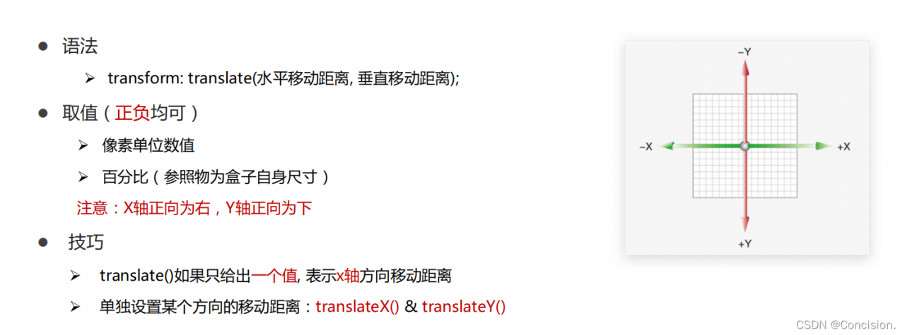
注意:一般要加过渡属性transition: all 0.5s;这样就会显示移动的效果。谁变化就加谁身上
<!DOCTYPE html>
<html lang="en">

<head>
    <meta charset="UTF-8">
    <meta http-equiv="X-UA-Compatible" content="IE=edge">
    <meta name="viewport" content="width=device-width, initial-scale=1.0">
    <title>位移-基本使用</title>
    <style>
        .father {
            width: 500px;
            height: 300px;
            margin: 100px auto;
            border: 1px solid #000;
        }

        .son {
            width: 200px;
            height: 100px;
            background-color: pink;
            transition: all 0.5s;
        }
        /* 鼠标移入到父盒子,son改变位置 */

        .father:hover .son {
            /* transform: translate(100px, 50px); */
            /* 百分比: 盒子自身尺寸的百分比 */
            /* transform: translate(100%, 50%); */
            /* transform: translate(-100%, 50%); */
            /* 只给出一个值表示x轴移动距离 */
            /* transform: translate(100px); */
            transform: translateY(100px);
        }
    </style>
</head>

<body>
    <div class="father">
        <div class="son"></div>
    </div>
</body>

</html>
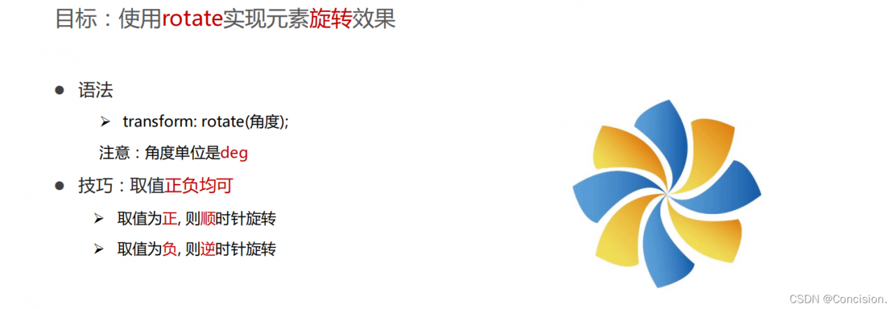
旋转
img {
          width: 250px;
          transition: all 2s;  /*必须加*/
      }

      img:hover {
          /* 顺 */
          transform: rotate(360deg);

          /* 逆 */
          /* transform: rotate(-360deg); */
      }
修改寻转中心点
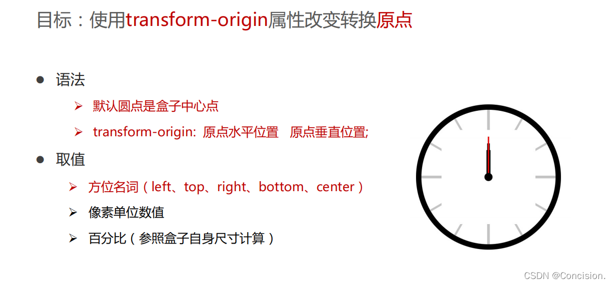
img {
     width: 250px;
     border: 1px solid #000;
     transition: all 2s;
     transform-origin: left bottom;
 }

 img:hover {
     transform: rotate(360deg);
 }
多重转换
使用transform复合属性实现多形态转换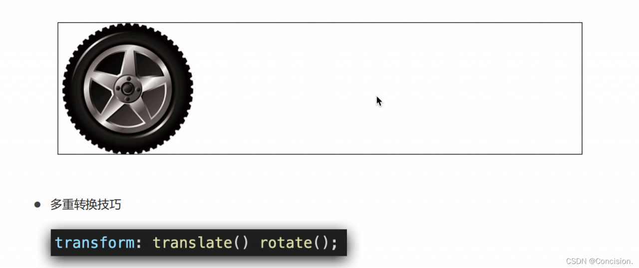
  .box {
      width: 800px;
      height: 200px;
      border: 1px solid #000;
  }

  img {
      width: 200px;
      transition: all 8s;
  }

  .box:hover img {
      /* 边走边转 */
      /* transform: translate(600px) rotate(360deg); */
      /* 旋转可以改变坐标轴向 */
      transform: rotate(360deg) translate(600px);
      /* 层叠性 */
      /* transform: translate(600px);
      transform: rotate(360deg); */
  }
注意:不能写成transform: rotate(360deg) translate(600px);,因为旋转可以改变坐标轴向,影响平移,所以复合属性要先写平移再写旋转。
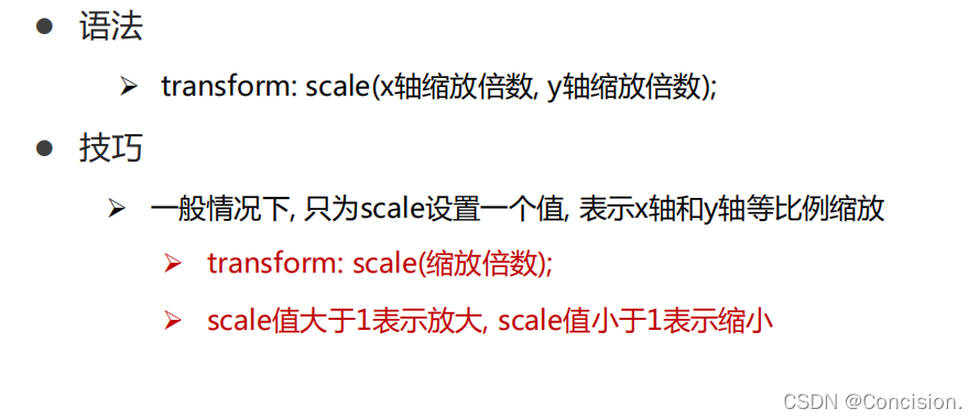
缩放
.box {
      width: 300px;
      height: 210px;
      margin: 100px auto;
      background-color: pink;
      overflow: hidden;
  }

  .box img {
      width: 100%;
      transition: all 0.5s;
  }

  .box:hover img {
      /* 放大 */
      transform: scale(1.2);
  }
注意:缩放也可以加复合属性,比如transform: translate(-50%, -50%) scale(5);。
2. 渐变背景
渐变是多个颜色逐渐变化的视觉效果,一般用于设置盒子的背景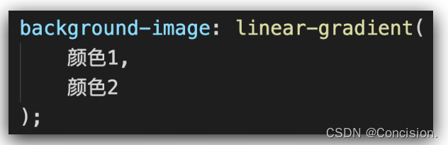
.box {
     width: 300px;
     height: 200px;
     /* background-image: linear-gradient(
         可多种颜色渐变
         pink,
         green,
         hotpink
     ); */
     background-image: linear-gradient(
         transparent, /*透明颜色*/
         rgba(0,0,0, .6)
     );
 }
3.空间转换
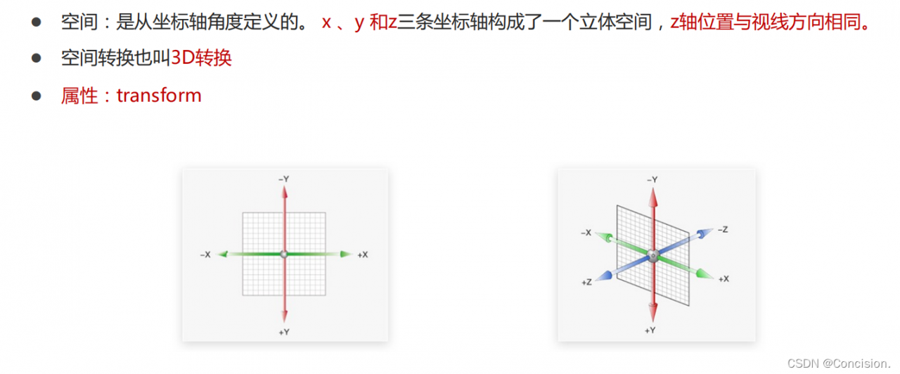
平移
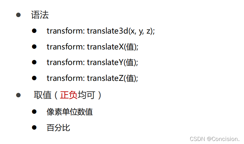
注意:z轴变化在平面上看不到,需要使用属性perspective实现透视效果,近大远小、近实远虚。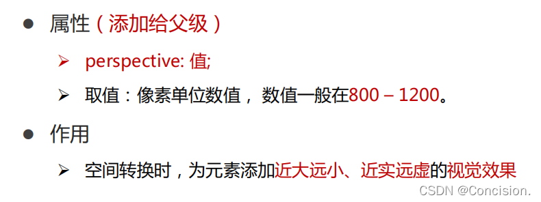
其中的值就是透视距离也称为视距,就是人的眼睛到屏幕的距离。如果取值很小则变化很大,如果取值很大则没什么变化,效果不是很好。
body {
	 /* 给父亲加 */
     perspective: 1000px;
 }

 .box {
     width: 200px;
     height: 200px;
     margin: 100px auto;
     background-color: pink;
     transition: all 0.5s;
 }

 .box:hover {
     transform: translateZ(200px);
     /* transform: translateZ(-200px); */
 }
空间旋转
transform: rotateZ(值);  /*和平面的rotate一样*/
transform: rotateX(值);
transform: rotateY(值);
通过左手法制判断旋转方向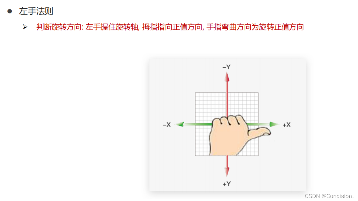
拓展:rotate3d(x, y, z, 角度度数) 用来设置自定义旋转轴的位置及旋转的角度,其中x,y,z 取值为0-1之间的数字。
立体图形
可以使用transform-style: preserve-3d呈现立体图形,使子元素处于真正的3d空间。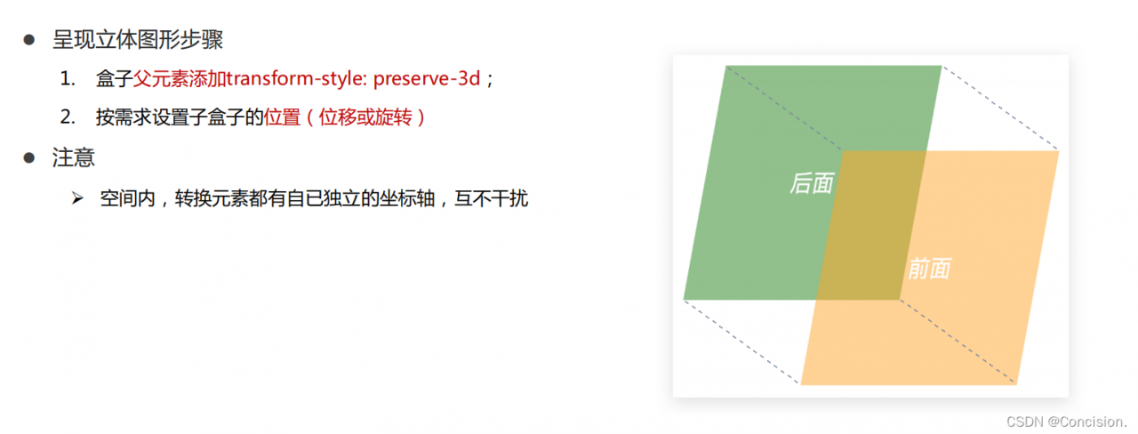
<!DOCTYPE html>
<html lang="en">

<head>
    <meta charset="UTF-8">
    <meta http-equiv="X-UA-Compatible" content="IE=edge">
    <meta name="viewport" content="width=device-width, initial-scale=1.0">
    <title>立体呈现</title>
    <style>
        .cube {
            position: relative;
            width: 200px;
            height: 200px;
            margin: 100px auto;
            background-color: pink;
            transition: all 2s;
            transform-style: preserve-3d;
        }

        .cube div {
            position: absolute;
            left: 0;
            top: 0;
            width: 200px;
            height: 200px;
        }

        .front {
            background-color: orange;
            /* 向我走近200px */
            transform: translateZ(200px);
        }

        .back {
            background-color: green;
        }
        /* cube hover 为了看空间感效果 */

        .cube:hover {
            transform: rotateY(90deg);
        }
    </style>
</head>

<body>
    <div class="cube">
        <div class="front">前面</div>
        <div class="back">后面</div>
    </div>
</body>

</html>
空间缩放
某个方向
transform: scaleX(倍数);
transform: scaleY(倍数);
transform: scaleZ(倍数);

3个方向缩放
transform: scale3d(x, y, z)
4. 动画(animation)
关键帧
1.关键帧 @keyframes :通过在动画序列中定义关键帧的样式来控制CSS动画序列中的中间步骤。
@keyframes change {
     from{
         width: 200px;
     }
     to{
         width: 600px;
     }
 }
2.如果多个关键帧使用同一个名称,以最后一次定义的为准。 @keyframes 不存在层叠样式的情况,所以动画在一个时刻(阶段)只会使用一个的关键帧的数据。
3.关键帧中出现的!important将会被忽略。
@keyframes important1 {
  from { margin-top: 50px; }
  50%  { margin-top: 150px !important; } /* 忽略 */
  to   { margin-top: 100px; }
}
动画属性
1.动画效果:实现多个状态间的变化过程,动画过程可控(重复播放、最终画面、是否暂停)
2.动画的本质是快速切换大量图片时在人脑中形成的具有连续性的画面。构成动画的最小单元:帧或动画帧
3.使用animation相关属性控制动画执行过程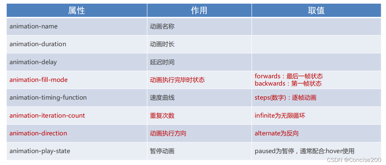
- 复合写法:

- 动画名称和动画时长必须赋值
- 取值不分先后顺序
- 如果有2个时间值,第一个时间表示动画时长,第二个时间表示延迟时间
5.使用
(1)简单使用
.box {
     width: 200px;
     height: 100px;
     background-color: pink;

     /* 使用动画 */
     animation: change 1s;
 }

 /* 一. 定义动画:从200变大到600 */
 /* @keyframes change {
     from {
         width: 200px;
     }
     to {
         width: 600px;
     }
 } */


 /* 二. 定义动画:200 到 500*300 到 800*500 */
 /* 百分比指的是动画总时长的占比 */
 @keyframes change {
     0% {
         width: 200px;
     }
     50% {
         width: 500px;
         height: 300px;
     }
     100% {
         width: 800px;
         height: 500px;
     }
 }
(2)暂停功能
.box {
     width: 200px;
     height: 100px;
     background-color: pink;

     animation-name: change;
     animation-duration: 1s;
     animation-iteration-count: infinite;

 }

 .box:hover {
    /* 鼠标移入的时候暂停动画 */
    animation-play-state: paused;
 }
(3)复合使用
.box {
    width: 200px;
    height: 100px;
    background-color: pink;
    /* animation: change 1s linear; */

    /* 分步动画 */

    /* 3: 重复3次播放 */
    /* animation: change 1s steps(3) 1s 3; */

    /* 无限循环 */
    /* animation: change 1s infinite alternate; */

    /* 默认值, 动画停留在最初的状态 */
    /* animation: change 1s backwards; */

    /* 动画停留在结束状态 */
    animation: change 1s forwards;
}
6.使用steps实现逐帧动画(若没有steps则是补间动画)
逐帧动画:帧动画。开发中,一般配合精灵图实现动画效果。animation-timing-function: steps(N);(将动画过程等分成N份)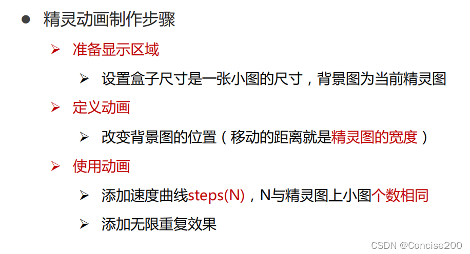
.box {
      /* 1680/12 : 保证显示区域的尺寸和一个精灵小图的尺寸相同 */
      width: 140px;
      height: 140px;
      border: 1px solid #000;
      background-image: url(./images/bg.png);
      /* 精灵图的个数 */
      animation: move 1s infinite steps(12);
    }

    @keyframes move {
        from {
          background-position: 0 0;
        }
        to {
          /* 1680: 精灵图的宽度 */
          background-position:  -1680px 0;
        }
    }