目录
app:boxStrokeWidth|app:boxStrokeWidthFocused
app:helperText|prefixText|suffixText
前言
Google为了整体风格的Material化,对输入框进行了优化处理,视觉效果非常棒,并且整体非常丝滑。
先展示几个google为我们设计的风格。
  <com.google.android.material.textfield.TextInputLayout
        ...
        style="@style/Widget.MaterialComponents.TextInputLayout.OutlinedBox">

    </com.google.android.material.textfield.TextInputLayout>
  <com.google.android.material.textfield.TextInputLayout
        ...
        style="@style/Widget.MaterialComponents.TextInputLayout.FilledBox">

    </com.google.android.material.textfield.TextInputLayout>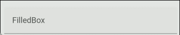
注:后缀加.Dense的为紧密版,高度变小,整体更紧凑。
TextInputLayout布局属性
| 属性 | TextInputLayout | 备注 |
|---|---|---|
| android:hint | 浮动提示 | TextInputLayout与TextInputEditText中设置均有效,也可同时设置 |
| app:counterMaxLength | 设置可输入字符的最大长度 | app:counterEnabled="true" 必须设置此属性才可展示 |
| app:counterTextColor | 设置可输入字符数量显示的颜色 | |
| app:counterOverflowTextColor | 设置可输入字符数量显示溢出(超过限制最大长度)的颜色 | |
| app:counterTextAppearance | 可输入字符数量Text外观 | |
| app:counterOverflowTextAppearance | 可输入字符数量Text溢出外观 | |
| app:barrierAllowsGoneWidgets | 引用形成Barrier的视图的大小或位置发生变化,该边距会发生变化,像屏障一样会形成拉扯 | app:constraint_referenced_ids="tv1,tv2" 与其他两个布局形成barrierd屏障, app:barrierDirection 屏障拉扯方向 |
| app:boxBackgroundMode | 填充框模式 | outline去掉线,背景都在。none 是都去掉。filled是默认的,有线。优先级比直接设置style高 |
| app:boxBackgroundColor | 填充框背景颜色 | |
| app:boxStrokeColor | 填充框底部下滑线颜色 | |
| app:boxStrokeErrorColor | 填充框底部下划线溢出(超过限制最大长度)颜色 | |
| app:boxStrokeWidth | 填充框底部下划线未选中时宽度 | |
| app:boxStrokeWidthFocused | 填充框底部下划线选中时宽度 | |
app:boxCornerRadiusTopStart app:boxCornerRadiusTopEnd app:boxCornerRadiusBottomStart | 左上圆角, 右上圆角, 左下圆角, 右下圆角 | |
| app:boxCollapsedPaddingTop | 填充框距离边界 | 不建议调整,默认的很好 |
app:startIconMode app:endIconMode | none:空 custom:自定义 password_toggle:可使密码切换 clear_text:清空 dropdown_menu:下拉菜单 | custom:配合app:endIconDrawable一起放自定义图片 |
app:startIconContentDescription app:endIconContentDescription | 内容说明 | |
app:startIconDrawable app:endIconDrawable | 前后图标设置 | |
app:startIconTint app:endIconTint | 前后图标矢量图着色 | |
app:helperText app:prefixText app:suffixText | 辅助文本 前缀文本 后缀文本 | |
app:helperTextTextAppearance app:prefixTextAppearance app:suffixTextAppearance | 辅助文本外观 前缀文本外观 后缀文本外观 | 可改文字大小 颜色等 |
app:helperTextTextColor app:prefixTextColor app:suffixTextColor | 辅助文本颜色 前缀文本颜色 后缀文本颜色 | |
app:errorTextColor app:errorIconDrawable app:errorIconTint | 溢出文本颜色 溢出图标 溢出图标矢量图着色 | |
| app:hintAnimationEnabled | 浮动提示动画效果 | |
| app:hintTextColor | 浮动提示颜色(溢出前) | |
| app:passwordToggleDrawable app:passwordToggleTint app:passwordToggleEnabled | 密码模式后缀图标 密码模式后缀图标着色 密码模式是否开启 | app:passwordToggleDrawable不建议设置,用默认效果最好 |
| app:passwordToggleContentDescription | 密码内容说明 | |
android:hint
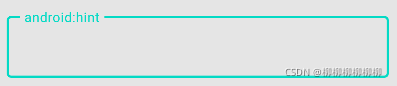
  <com.google.android.material.textfield.TextInputLayout
        ...
        style="@style/Widget.MaterialComponents.TextInputLayout.OutlinedBox"
        android:hint="android:hint">

    </com.google.android.material.textfield.TextInputLayout>
app:counterEnabled
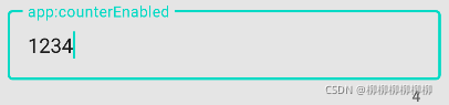
  <com.google.android.material.textfield.TextInputLayout
        ...
        style="@style/Widget.MaterialComponents.TextInputLayout.OutlinedBox"
        app:counterEnabled="true">

    </com.google.android.material.textfield.TextInputLayout>
app:counterMaxLength
注:app:counterEnabled="true"。
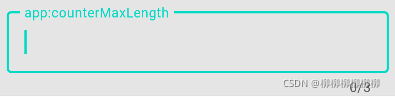
  <com.google.android.material.textfield.TextInputLayout
        ...
        style="@style/Widget.MaterialComponents.TextInputLayout.OutlinedBox"
        app:counterMaxLength="3"
        app:counterEnabled="true">

    </com.google.android.material.textfield.TextInputLayout>
app:counterTextColor
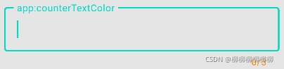
  <com.google.android.material.textfield.TextInputLayout
        ...
        style="@style/Widget.MaterialComponents.TextInputLayout.OutlinedBox"
        app:counterMaxLength="3"
        app:counterEnabled="true"
        app:counterTextColor="@color/orange">

    </com.google.android.material.textfield.TextInputLayout>
app:counterOverflowTextColor
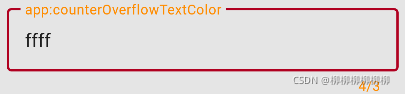
  <com.google.android.material.textfield.TextInputLayout
        ...
        style="@style/Widget.MaterialComponents.TextInputLayout.OutlinedBox"
        app:counterMaxLength="3"
        app:counterEnabled="true"
        app:counterOverflowTextColor="@color/orange">

    </com.google.android.material.textfield.TextInputLayout>
app:counterTextAppearance
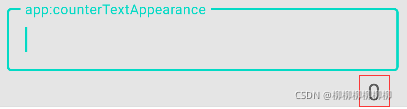
  <com.google.android.material.textfield.TextInputLayout
        ...
        style="@style/Widget.MaterialComponents.TextInputLayout.OutlinedBox"
        app:counterEnabled="true"
        app:counterTextAppearance="@style/counterTextAppearance">

    </com.google.android.material.textfield.TextInputLayout>
<style name="counterTextAppearance" parent="TextAppearance.AppCompat">
<item name="android:textSize">20sp</item>
<item name="android:textColor">@color/colorPrimaryDark</item>
</style>app:boxBackgroundColor
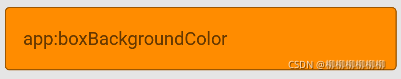
  <com.google.android.material.textfield.TextInputLayout
        ...
        style="@style/Widget.MaterialComponents.TextInputLayout.OutlinedBox"
        app:boxBackgroundColor="@color/orange">

    </com.google.android.material.textfield.TextInputLayout>
app:boxStrokeColor

  <com.google.android.material.textfield.TextInputLayout
        ...
        style="@style/Widget.MaterialComponents.TextInputLayout.FilledBox"
        app:boxStrokeColor="@color/orange">

    </com.google.android.material.textfield.TextInputLayout>
app:boxStrokeErrorColor
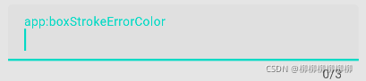
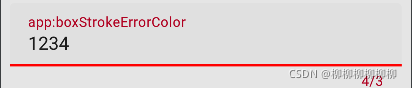
  <com.google.android.material.textfield.TextInputLayout
        ...
        style="@style/Widget.MaterialComponents.TextInputLayout.FilledBox"
        app:counterMaxLength="3"
        app:counterEnabled="true"
        app:boxStrokeErrorColor="@color/red">

    </com.google.android.material.textfield.TextInputLayout>
app:boxStrokeWidth|app:boxStrokeWidthFocused
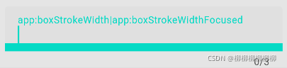
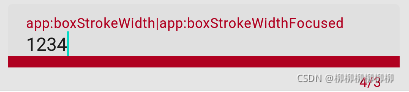
  <com.google.android.material.textfield.TextInputLayout
        ...
        style="@style/Widget.MaterialComponents.TextInputLayout.FilledBox"
        app:counterMaxLength="3"
        app:counterEnabled="true"
        app:boxStrokeWidth="10dp"
        app:boxStrokeWidthFocused="10dp">

    </com.google.android.material.textfield.TextInputLayout>
app:boxCornerRadius
如果把4个角全设置圆角的话就会出现这种情况,下划线会很突兀。
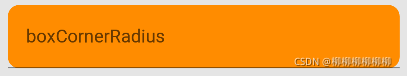
  <com.google.android.material.textfield.TextInputLayout
        ...
        style="@style/Widget.MaterialComponents.TextInputLayout.FilledBox"
        app:boxBackgroundColor="@color/orange"
        app:boxCornerRadiusBottomEnd="10dp"
        app:boxCornerRadiusBottomStart="10dp"
        app:boxCornerRadiusTopEnd="10dp"
        app:boxCornerRadiusTopStart="10dp">

    </com.google.android.material.textfield.TextInputLayout>
那么我们可以尝试 设置app:boxBackgroundMode="outline"。
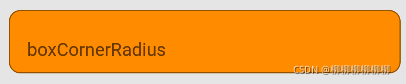
  <com.google.android.material.textfield.TextInputLayout
        ...
        style="@style/Widget.MaterialComponents.TextInputLayout.FilledBox"
        app:boxBackgroundColor="@color/orange"
        app:boxCornerRadiusBottomEnd="10dp"
        app:boxCornerRadiusBottomStart="10dp"
        app:boxCornerRadiusTopEnd="10dp"
        app:boxCornerRadiusTopStart="10dp"
        app:boxBackgroundMode="outline">

    </com.google.android.material.textfield.TextInputLayout>
或者只设置左上跟右上 。
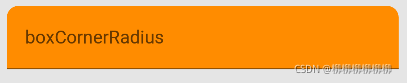
  <com.google.android.material.textfield.TextInputLayout
        ...
        style="@style/Widget.MaterialComponents.TextInputLayout.FilledBox"
        app:boxBackgroundColor="@color/orange"
        app:boxCornerRadiusTopEnd="10dp"
        app:boxCornerRadiusTopStart="10dp"
        app:boxBackgroundMode="outline">

    </com.google.android.material.textfield.TextInputLayout>
app:startIconTint
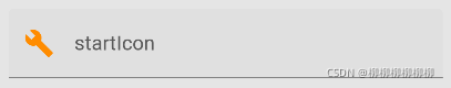
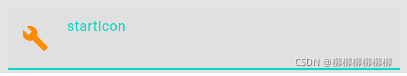
<com.google.android.material.textfield.TextInputLayout
...
style="@style/Widget.MaterialComponents.TextInputLayout.FilledBox"
app:startIconDrawable="@drawable/ic_menu_manage"
app:startIconTint="@color/orange">
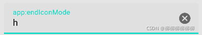
</com.google.android.material.textfield.TextInputLayout>app:endIconMode
endIconMode 上面说了,里面有五条属性,分别是
- none:空
- custom:自定义
- password_toggle:可使密码切换
- clear_text:清空
- dropdown_menu:下拉菜单
none不用过多说,就是空白,也是默认值,dropdown_menu是下拉菜单从,后面出文章会说
剩下三个的效果我会在下面展示。
  <com.google.android.material.textfield.TextInputLayout
        ...
        style="@style/Widget.MaterialComponents.TextInputLayout.FilledBox"
        app:endIconMode="clear_text">

    </com.google.android.material.textfield.TextInputLayout>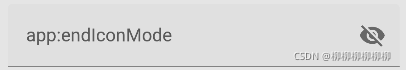
  <com.google.android.material.textfield.TextInputLayout
        ...
        style="@style/Widget.MaterialComponents.TextInputLayout.FilledBox"
        app:endIconMode="password_toggle">

    </com.google.android.material.textfield.TextInputLayout>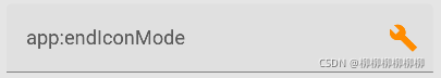
  <com.google.android.material.textfield.TextInputLayout
        ...
        style="@style/Widget.MaterialComponents.TextInputLayout.FilledBox"
        app:endIconDrawable="@drawable/ic_menu_manage"
        app:endIconMode="custom"
        app:endIconTint="@color/orange">

    </com.google.android.material.textfield.TextInputLayout>
app:helperText|prefixText|suffixText
辅助文本|前缀文本|后缀文本
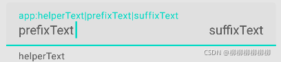
  <com.google.android.material.textfield.TextInputLayout
        ...
        style="@style/Widget.MaterialComponents.TextInputLayout.FilledBox"
        app:helperText="helperText"
        app:prefixText="prefixText"
        app:suffixText="suffixText">

    </com.google.android.material.textfield.TextInputLayout>
剩下的属性大体含义都差不多,相信大家也可以理解了。
收工。