display:flex 布局
一:display:flex 布局
display:flex 是一种布局方式。它即可以应用于容器中,也可以应用于行内元素。是W3C提出的一种新的方案,可以简便、完整、响应式地实现各种页面布局。目前,它已经得到了所有浏览器的支持。
Flex是Flexible Box的缩写,意为"弹性布局",用来为盒状模型提供最大的灵活性。设为Flex布局以后,子元素的float、clear和vertical-align属性将失效。
没加display: flex;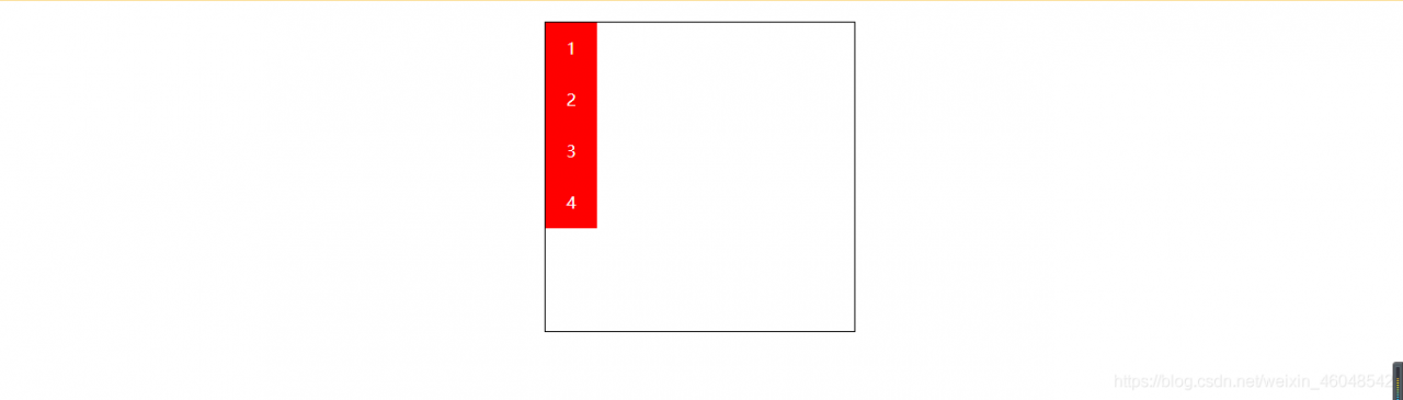
加了之后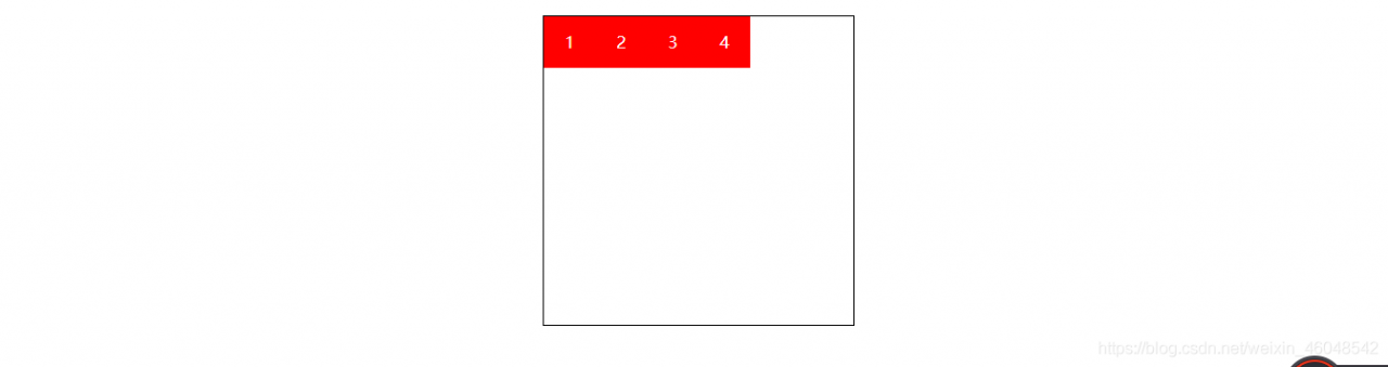
<!DOCTYPE html>
<html lang="en">
<head>
    <meta charset="UTF-8">
    <meta http-equiv="X-UA-Compatible" content="IE=edge">
    <meta name="viewport" content="width=device-width, initial-scale=1.0">
    <title>Document</title>
    <style>
        #box{width: 300px;height: 300px;border: 1px black solid;margin: 20px auto;display: flex;}
        #box div{width: 50px;height: 50px;color: white;line-height: 50px;text-align: center;background: red;}
    </style>
</head>
<body>
    <div id="box">
        <div>1</div>
        <div>2</div>
        <div>3</div>
        <div>4</div>
    </div>
</body>
</html>
flex-direction 属性规定灵活项目的方向。
flex-direction 属性规定灵活项目的方向。
注意:如果元素不是弹性盒对象的元素,则 flex-direction 属性不起作用。
默认值: row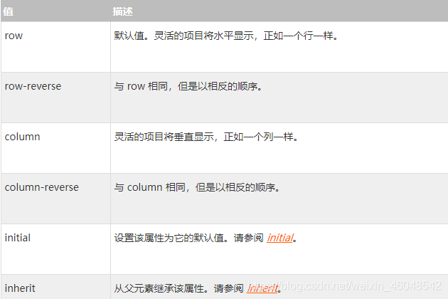
flex-direction: row|row-reverse|column|column-reverse|initial|inherit;
1:flex-direction:row; 沿水平主轴让元素从左向右排列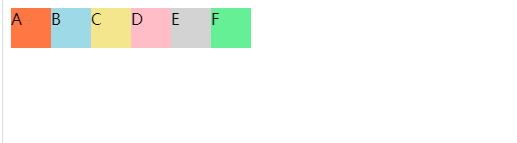
flex-direction:column; 让元素沿垂直主轴从上到下垂直排列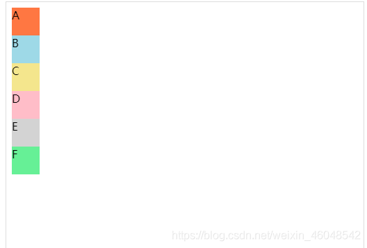
flex-direction:row-reverse;沿水平主轴让元素从右向左排列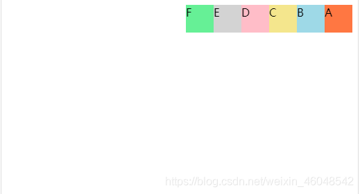
flex-wrap 容器内元素的换行(默认不换行)
flex-wrap 容器内元素的换行(默认不换行)
1:flex-wrap: nowrap; (默认)元素不换行,比如:一个div宽度100%,设置此属性,2个div宽度就自动变成各50%;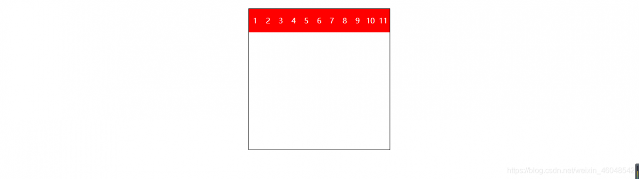
2:flex-wrap: wrap; 元素换行,比如:一个div宽度100%,设置此属性,第二个div就在第二行了;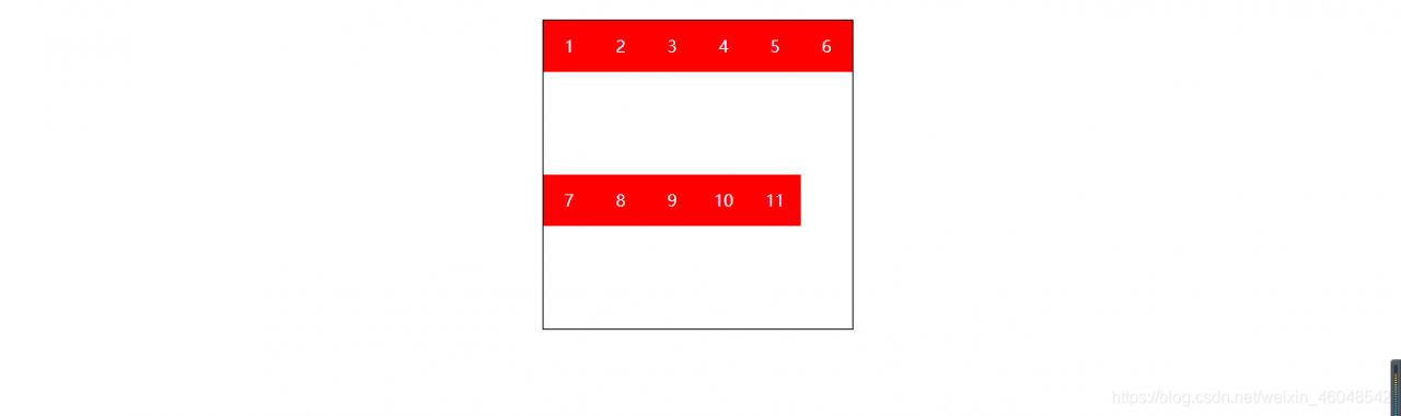
3:wrap-reverse 宽度不足换行显示,但是从下往上开始,也就是原本换行在下面的子项现在跑在上面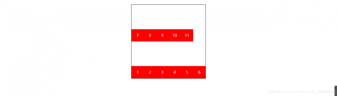
<!DOCTYPE html>
<html lang="en">
<head>
    <meta charset="UTF-8">
    <meta http-equiv="X-UA-Compatible" content="IE=edge">
    <meta name="viewport" content="width=device-width, initial-scale=1.0">
    <title>Document</title>
    <style>
        #box{width: 300px;height: 300px;border: 1px black solid;margin: 20px auto;display: flex;flex-wrap: wrap-reverse;}
        #box div{width: 50px;height: 50px;color: white;line-height: 50px;text-align: center;background: red;}
    </style>
</head>
<body>
    <div id="box">
        <div>1</div>
        <div>2</div>
        <div>3</div>
        <div>4</div>
        <div>5</div>
        <div>6</div>
        <div>7</div>
        <div>8</div>
        <div>9</div>
        <div>10</div>
        <div>11</div>
    </div>
</body>
</html>
display: flex;flex-wrap: wrap;flex-direction: column;
等价于
flex-flow:column wrap;
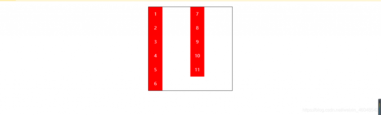
flex-flow 属性是 flex-direction 和 flex-wrap 属性的复合属性。
flex-flow 属性是 flex-direction 和 flex-wrap 属性的复合属性。
第一个值表示方向,第二个值表示换行,中间用空格隔开。
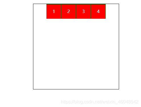
*justify-content 属性决定了主轴方向上子项的对齐和分布方式
justify-content 属性决定了主轴方向上子项的对齐和分布方式默认值: flex-start
1:justify-content : center;元素在主轴(页面)上居中排列
display: flex;flex-direction: row;justify-content: center;
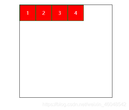
2:justify-content : flex-start;元素在主轴(页面)上由左或者上开始排列(表现为起始位置对齐)
display: flex;flex-direction: row;justify-content: flex-start;
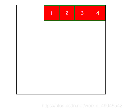
3:justify-content : flex-end;元素在主轴(页面)上由右或者下开始排列(表现为结束位置对齐)
display: flex;flex-direction: row;justify-content: flex-end;
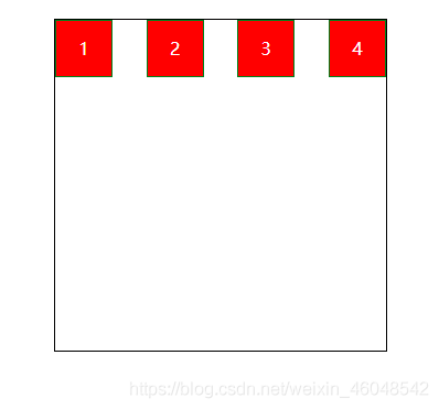
4:justify-content : space-between;元素在主轴(页面)上左右两端或者上下两端开始排列(表现为两端对齐,意思是多余的空白间距只在元素中间区域分配)
display: flex;flex-direction: row;justify-content: space-between;
5:justify-content : space-around;每个元素两侧的间隔相等。所以,元素之间的间隔比元素与边框的间隔大一倍。(around是环绕的意思,意思是每个flex子项两侧都环绕互不干扰的等宽的空白间距,最终视觉上边缘两侧的空白只有中间空白一半)
display: flex;flex-direction: row;justify-content: space-around;
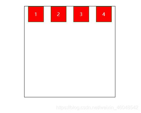
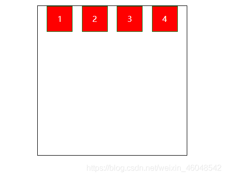
6:justify-content : space-evenly;evenly是匀称、对等的意思,也就是视觉上,每个flex子项两侧空白间距完全相等。
display: flex;flex-direction: row;justify-content: space-evenly;
<!DOCTYPE html>
<html lang="en">
<head>
    <meta charset="UTF-8">
    <meta http-equiv="X-UA-Compatible" content="IE=edge">
    <meta name="viewport" content="width=device-width, initial-scale=1.0">
    <title>Document</title>
    <style>
        #box{width: 300px;height: 300px;border: 1px black solid;margin: 20px auto;display: flex;flex-direction: row;justify-content: space-evenly;}
        #box div{width: 50px;height: 50px;color: white;line-height: 50px;text-align: center;background: red;border: 1px green solid;}
    </style>
</head>
<body>
    <div id="box">
        <div>1</div>
        <div>2</div>
        <div>3</div>
        <div>4</div>
    </div>
</body>
</html>
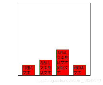
align-items:flex子项们相对于flex容器在侧轴方向上的对齐方式
align-items:flex子项们相对于flex容器在侧轴方向上的对齐方式,默认值: stretch
stretch 默认,flex子项拉伸。
display: flex;justify-content: space-evenly;flex-wrap: wrap;align-items: stretch;
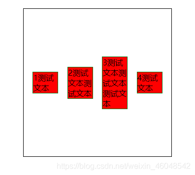
center 表现为垂直中间对齐
display: flex;justify-content: space-evenly;flex-wrap: wrap;align-items: center;
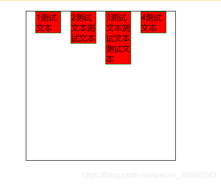
flex-start 表现为容器顶部对齐
display: flex;justify-content: space-evenly;flex-wrap: wrap;align-items: flex-start;
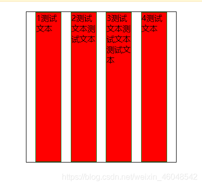
flex-end 表现为容器底部对齐。
display: flex;justify-content: space-evenly;flex-wrap: wrap;align-items: flex-end;
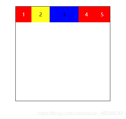
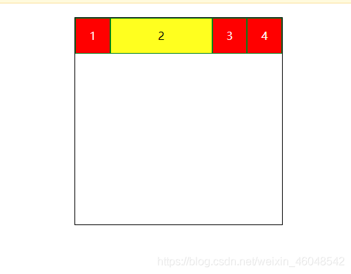
flex-grow
flex-grow :grow是扩展的意思,扩展的就是flex子项所占据的宽度扩展为所侵占的空间就是除去元素外剩余的空白间隙,默认值为0
<!DOCTYPE html>
<html lang="en">
<head>
    <meta charset="UTF-8">
    <meta http-equiv="X-UA-Compatible" content="IE=edge">
    <meta name="viewport" content="width=device-width, initial-scale=1.0">
    <title>Document</title>
    <style>
        #box{width: 300px;height: 300px;border: 1px black solid;margin: 20px auto;display: flex;}
        #box div{width: 50px;height: 50px;color: white;line-height: 50px;text-align: center;background: red;}
        #box div:nth-child(2){background: yellow;color: black;flex-grow: 0.2;}
        #box div:nth-child(3){background: blue;color: black;flex-grow: 1;}
    </style>
</head>
<body>
    <div id="box">
        <div>1</div>
        <div>2</div>
        <div>3</div>
        <div>4</div>
        <div>5</div>
    </div>
</body>
</html>
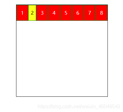
flex-shrink
flex-shrink属性中的shrink是收缩的意思,主要处理flex容器空间不足时候,单个元素的收缩比例,单个元素的收缩比例,默认值是1.
flex-shrink: 2;
<!DOCTYPE html>
<html lang="en">
<head>
    <meta charset="UTF-8">
    <meta http-equiv="X-UA-Compatible" content="IE=edge">
    <meta name="viewport" content="width=device-width, initial-scale=1.0">
    <title>Document</title>
    <style>
        #box{width: 300px;height: 300px;border: 1px black solid;margin: 20px auto;display: flex;}
        #box div{width: 50px;height: 50px;color: white;line-height: 50px;text-align: center;background: red;border: 1px green solid;}
        #box div:nth-child(2){background: yellow;color: black;flex-shrink: 2;}
        /* #box div:nth-child(3){background: blue;color: black;flex-grow: 1;} */
    </style>
</head>
<body>
    <div id="box">
        <div>1</div>
        <div>2</div>
        <div>3</div>
        <div>4</div>
        <div>5</div>
        <div>6</div>
        <div>7</div>
        <div>8</div>
    </div>
</body>
</html>
flex-basis定义了在分配剩余空间之前元素的默认大小
flex-basis: 150px;
等价于
width:100px:
但优先级比width高,同时设置的话,以flex-basis的数据为准
<!DOCTYPE html>
<html lang="en">
<head>
    <meta charset="UTF-8">
    <meta http-equiv="X-UA-Compatible" content="IE=edge">
    <meta name="viewport" content="width=device-width, initial-scale=1.0">
    <title>Document</title>
    <style>
        #box{width: 300px;height: 300px;border: 1px black solid;margin: 20px auto;display: flex;}
        #box div{width: 50px;height: 50px;color: white;line-height: 50px;text-align: center;background: red;border: 1px green solid;}
        #box div:nth-child(2){background: yellow;color: black;flex-basis: 150px;}
        /* #box div:nth-child(3){background: blue;color: black;flex-grow: 1;} */
    </style>
</head>
<body>
    <div id="box">
        <div>1</div>
        <div>2</div>
        <div>3</div>
        <div>4</div>
    </div>
</body>
</html>
flex属性是flex-grow,flex-shrink和flex-basis的缩写
flex属性是flex-grow,flex-shrink和flex-basis的缩写
align-self指控制单独某一个flex子项的垂直对齐方式
align-self指控制单独某一个flex子项的垂直对齐方式
align-self: center;
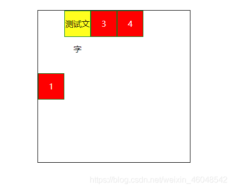
<!DOCTYPE html>
<html lang="en">
<head>
    <meta charset="UTF-8">
    <meta http-equiv="X-UA-Compatible" content="IE=edge">
    <meta name="viewport" content="width=device-width, initial-scale=1.0">
    <title>Document</title>
    <style>
        #box{width: 300px;height: 300px;border: 1px black solid;margin: 20px auto;display: flex;}
        #box div{width: 50px;height: 50px;color: white;line-height: 50px;text-align: center;background: red;border: 1px green solid;}
        #box div:nth-child(2){background: yellow;color: black;}
        /* #box div:nth-child(3){background: blue;color: black;flex-grow: 1;} */
        #box div:nth-child(1){align-self: center;}
    </style>
</head>
<body>
    <div id="box">
        <div>1</div>
        <div>测试文字</div>
        <div>3</div>
        <div>4</div>
    </div>
</body>
</html>
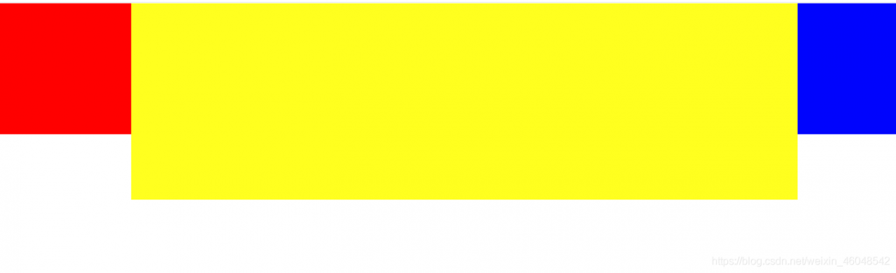
自适应flex: 1;占满剩余空间
自适应flex: 1;占满剩余空间
<!DOCTYPE html>
<html lang="en">
<head>
    <meta charset="UTF-8">
    <meta http-equiv="X-UA-Compatible" content="IE=edge">
    <meta name="viewport" content="width=device-width, initial-scale=1.0">
    <title>Document</title>
    <style>
        *{margin: 0;padding: 0;}
        #main{display: flex;}
        #left{width: 200px;height: 200px;background: red;}
        #center{flex: 1;height: 300px;background: yellow;}
        #right{width: 150px;height: 200px;background: blue;}
    </style>
</head>
<body>
    <div id="main">
        <div id="left"></div>
        <div id="center"></div>
        <div id="right"></div>
    </div>
</body>
</html>
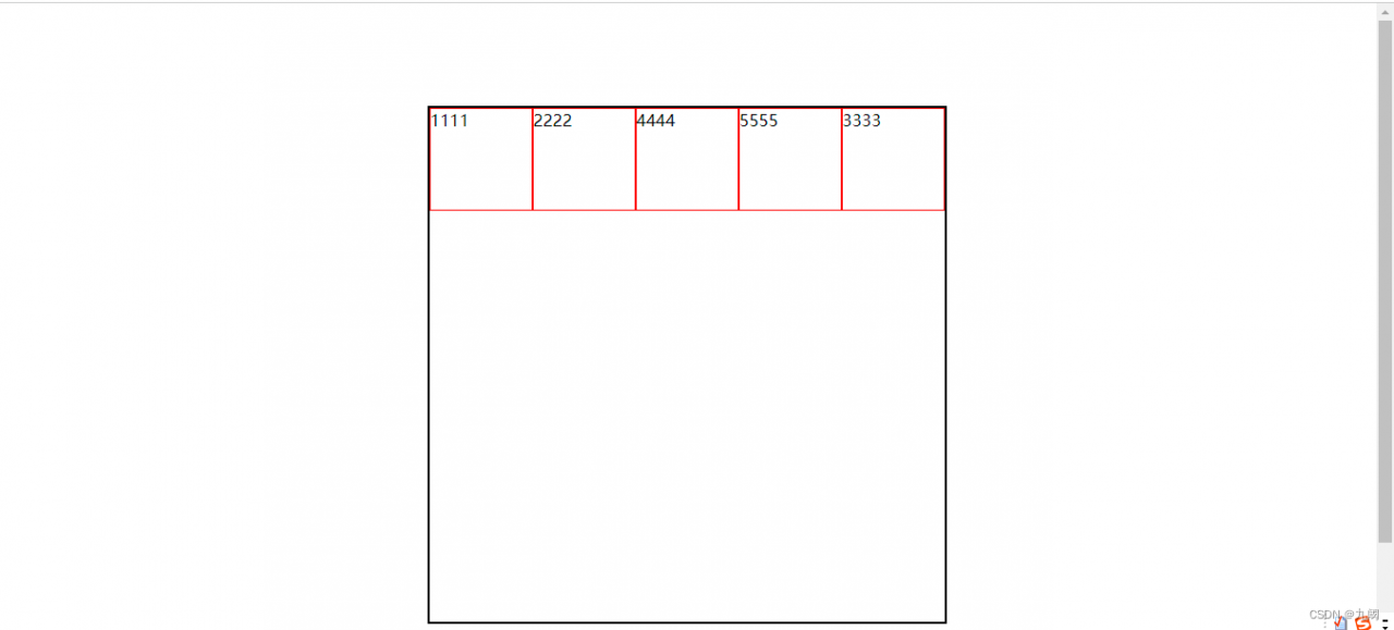
调整顺序order: 0;默认值
<!DOCTYPE html>
<html lang="en">
<head>
    <meta charset="UTF-8">
    <meta http-equiv="X-UA-Compatible" content="IE=edge">
    <meta name="viewport" content="width=device-width, initial-scale=1.0">
    <title>Document</title>
    <style>
        .box{
            width: 500px;
            height: 500px;
            border: 2px solid black;
            margin: 100px auto;
            display: flex;
            flex-direction: row;
        }
        .box div{
            width: 100px;
            height: 100px;
            border: 1px solid red;
            box-sizing: border-box;
        }
        .div2{
            order: 0;
            /* 默认值 */
        }

        .div3{
            order: 1;
        }
    </style>
</head>
<body>
    <div class="box">
        <div class="div1">1111</div>
        <div class="div2">2222</div>
        <div class="div3">3333</div>
        <div class="div4">4444</div>
        <div class="div5">5555</div>
    </div>
</body>
</html>